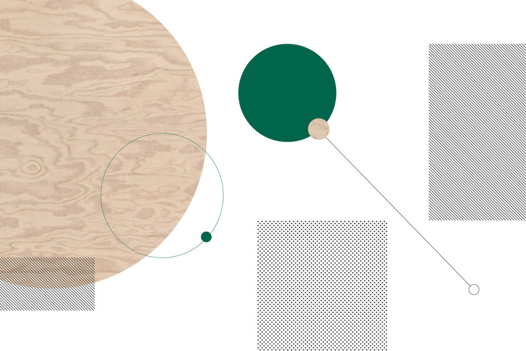
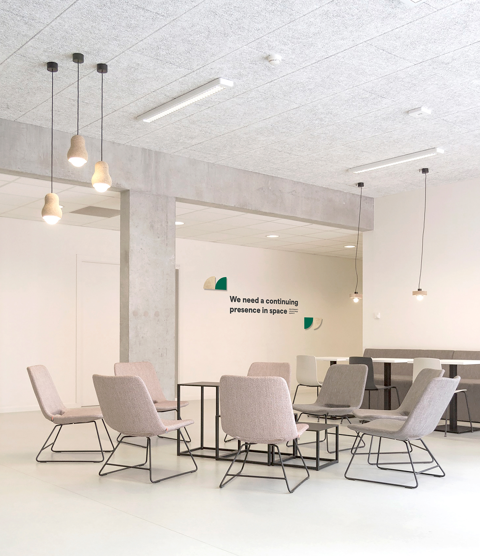
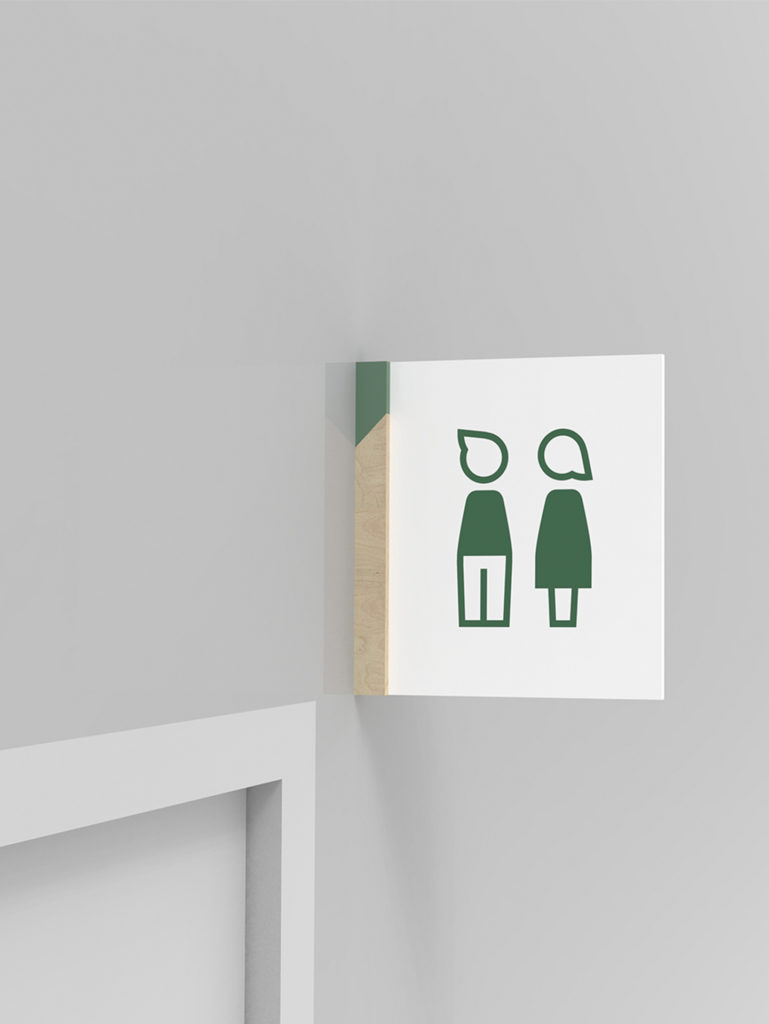
One of the main design assumptions of the wayfinding system created for Credit Agricole offices was maintaining the graphic reference to the character of the place. Our inspiration here were motives assigned to each floor, however, reinterpreted by us. The interiors of the Credit Agricole headquarters were dominated by plywood. When creating carriers and wall graphics we have tried to refer to this material. This approach allowed us to create a coherent and attractive marking.
The goal was to design simple and readable infographics that would refer to the given topic, and apart from being just a visual element it would also be an additional layer of information about the company’s activities. Due to their scale, graphics made the space more friendly, legible and, above all, easier to navigate.


