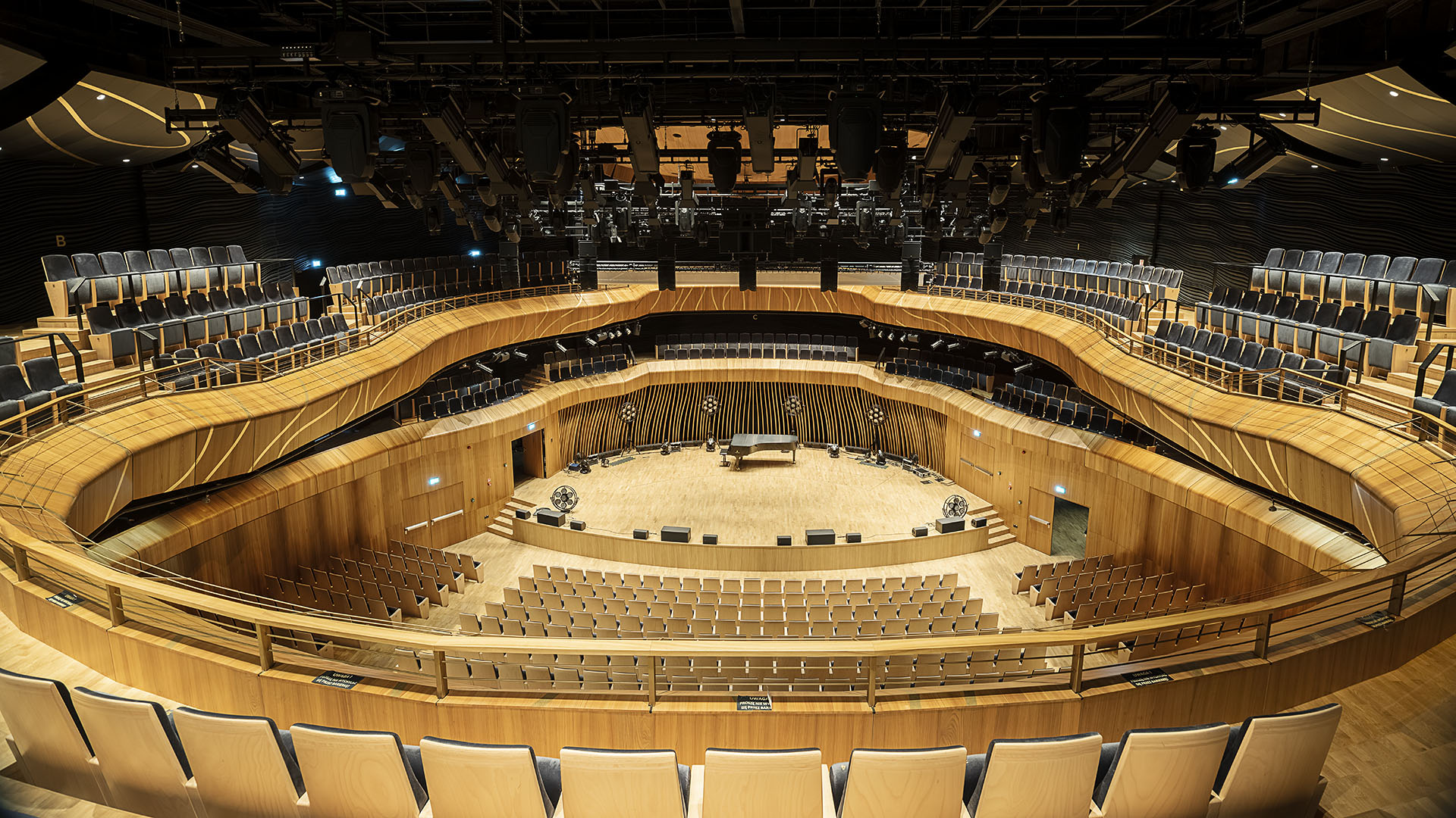
Cavatina Hall is the first concert hall in Poland opened by a business investor, the Cavatina Group. The project uniquely combines office and cultural functions. The building includes a high-class recording studio and a concert hall for 1,000 people, Also this building can be successfully used for conferences and presentations.
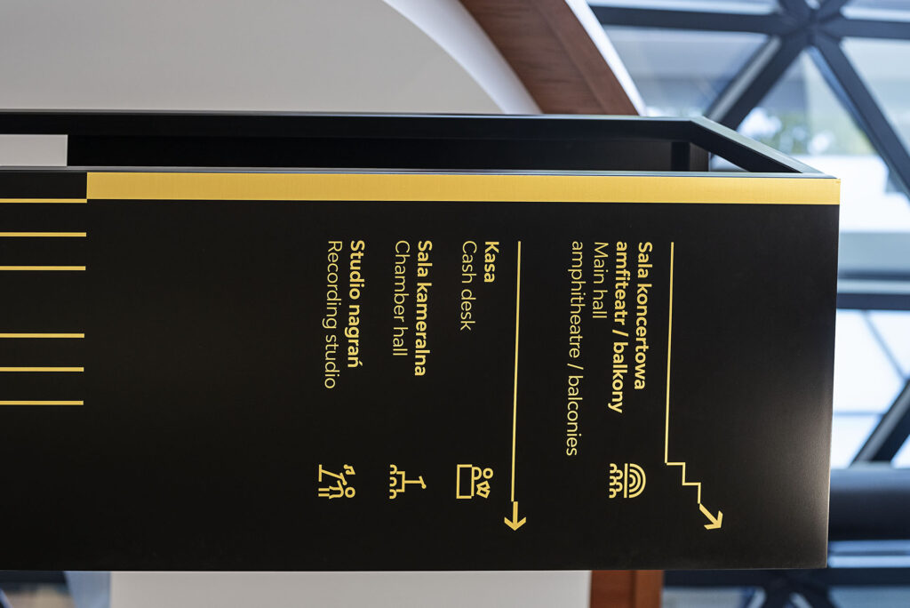
A characteristic element that we observed in Cavatina’s interior architecture are the numerous divisions, repetitive rhythms and form’s shifts, which we also tried to reproduce in the design of our wayfinding system. By putting these kind of elements into the signage design, the entire interior gained a dynamic and elegant character. The orientation system had to fit in with the existing space and harmoniously interact with it. We also decided on a limited but distinctive colour scheme – the signage is based on three colours – white, black and gold.
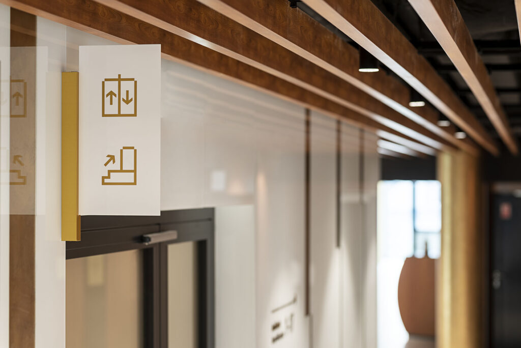
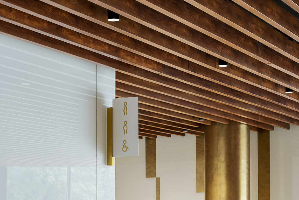
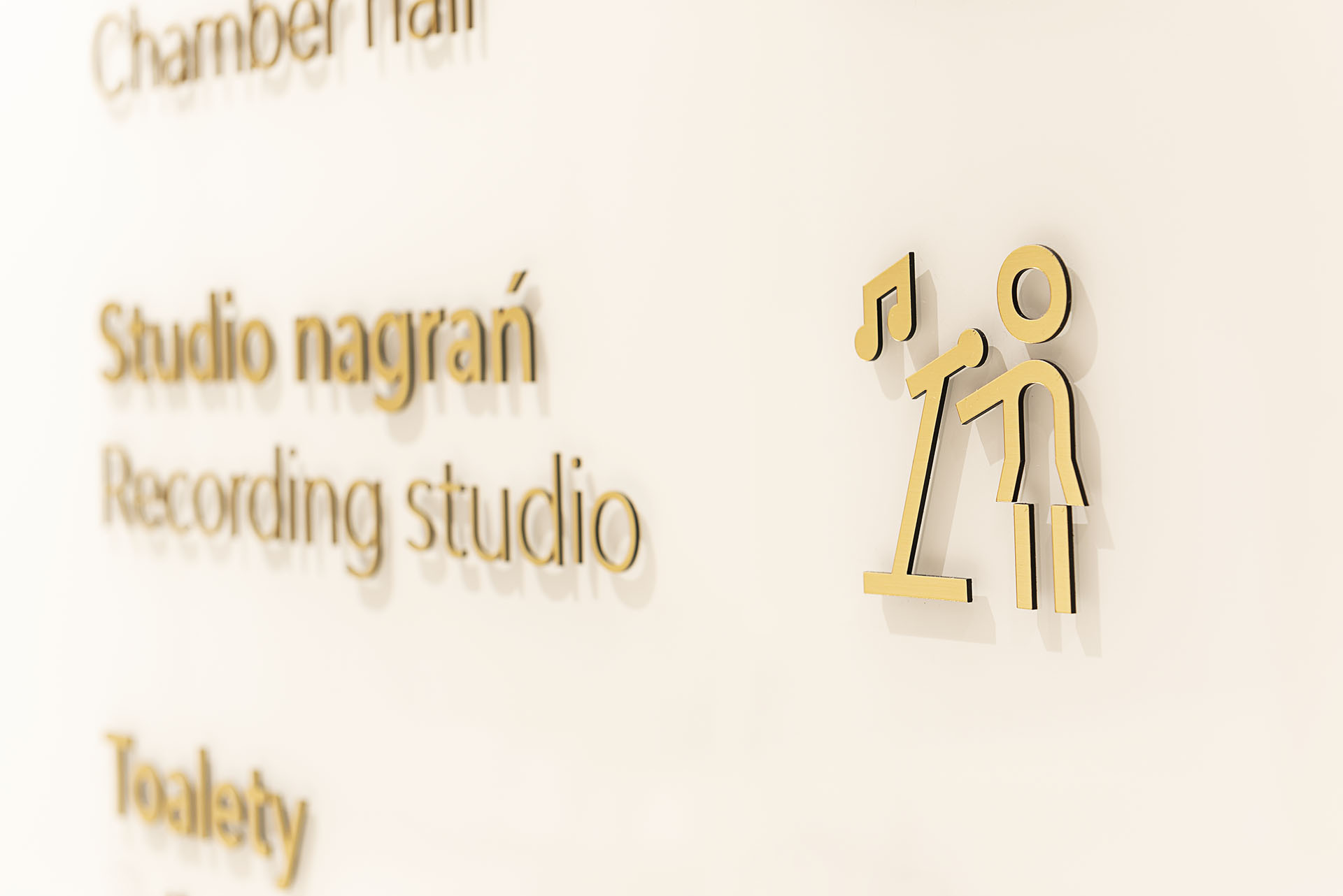
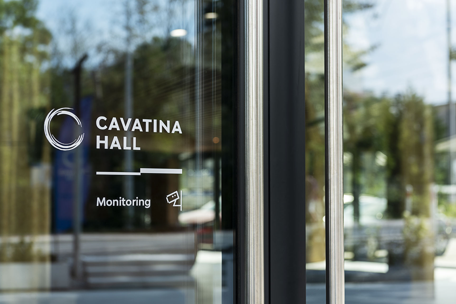
In the course of the design process, we decided to choose the Bw Modelica typeface, which was also used in the branding of the Cavatina. The font used in the design is also the basis for the original letters and arrows used to mark the sectors in the concert hall. They were inspired by the rhythmic divisions mentioned earlier, appearing in the design of the interior architecture. The graphic line of the wayfinding system also includes personalised, original pictogram set, in the shape of which we also tried to include characteristic rhythms and shifts of form.
Equally important was the 3D, industrial design of the information carriers. Based on the previously selected colour scheme and rules for building the information layouts, we have used materials that coherently complemented the identity of the facility, while also meeting the investor’s key requirement.

