Every building can have its own ‘jewellery’! All thanks to tailor-made signage – it will make the user more likely to return to a place they consider safe, aesthetically pleasing and well-connected.
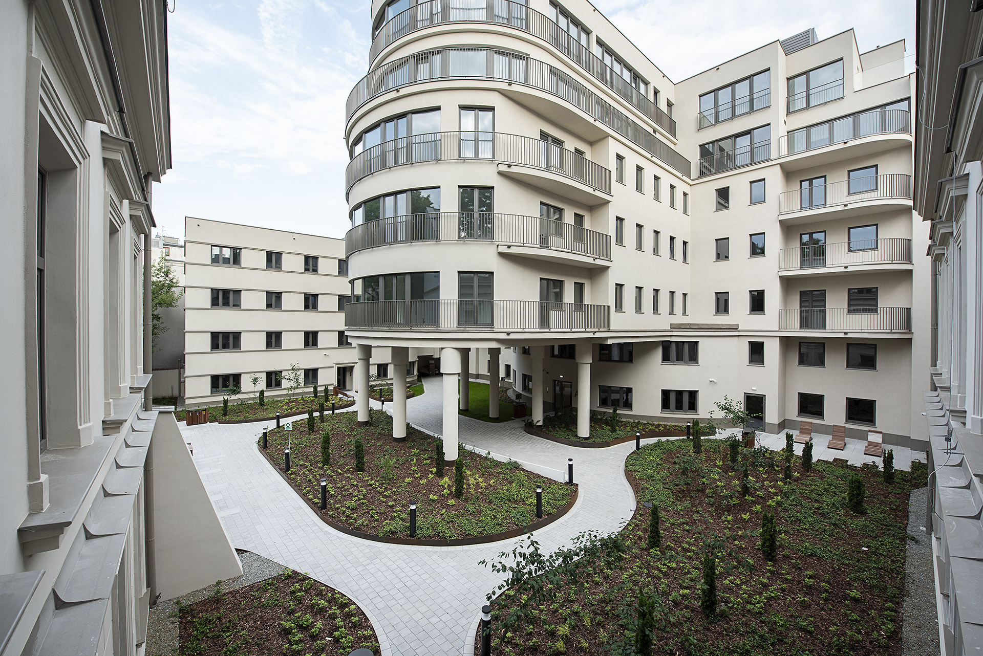
A wayfinding for Noble Residence in Kraków is really a kind of ‘jewellery’ realisation. Noble Residence, an investment by UBM Development, is a stylish apartment building that harmoniously combines modernist minimalism with modernity and 21st century solutions.
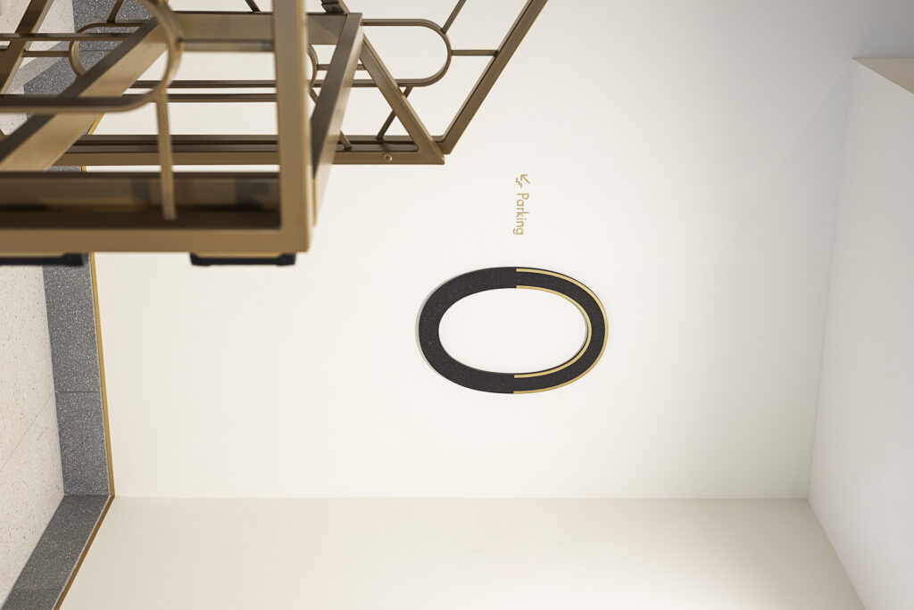
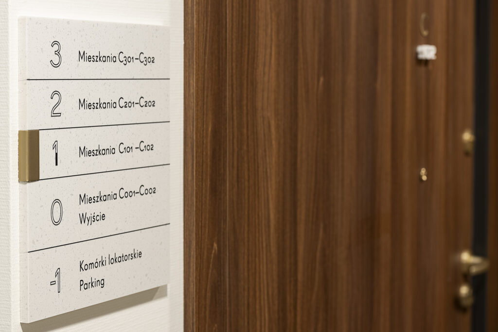
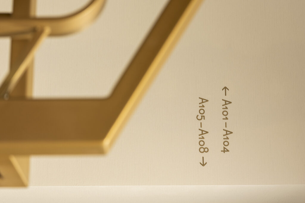
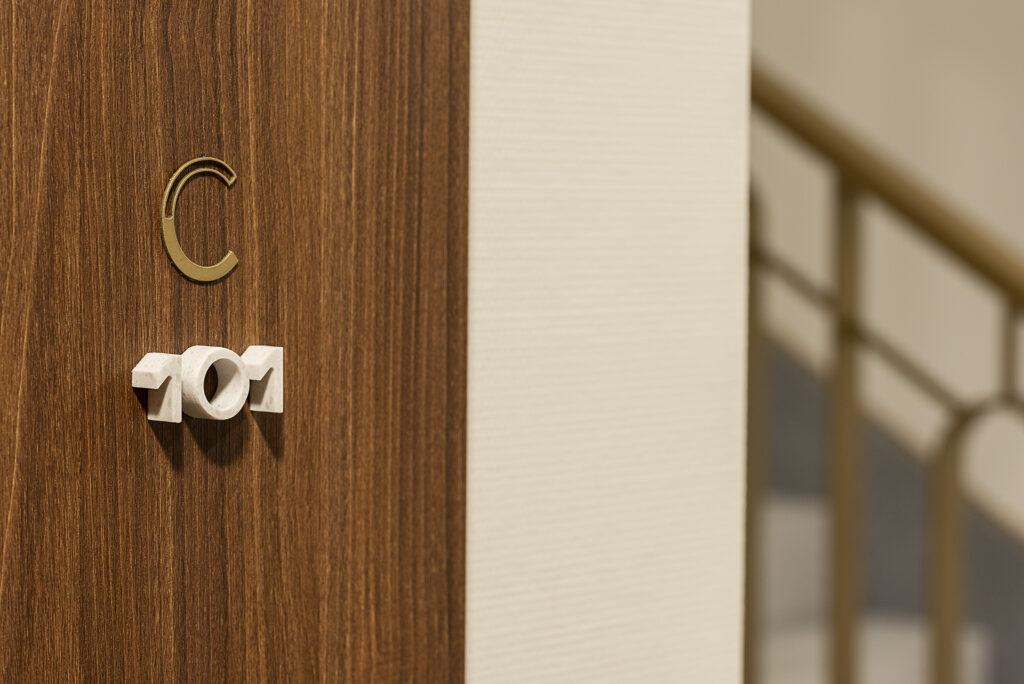
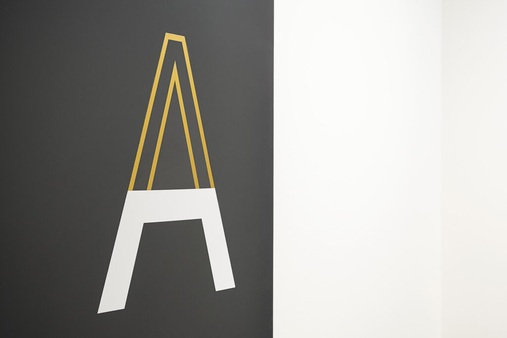
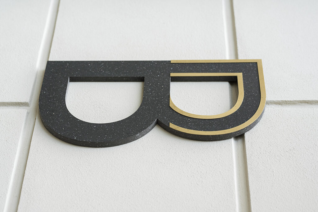
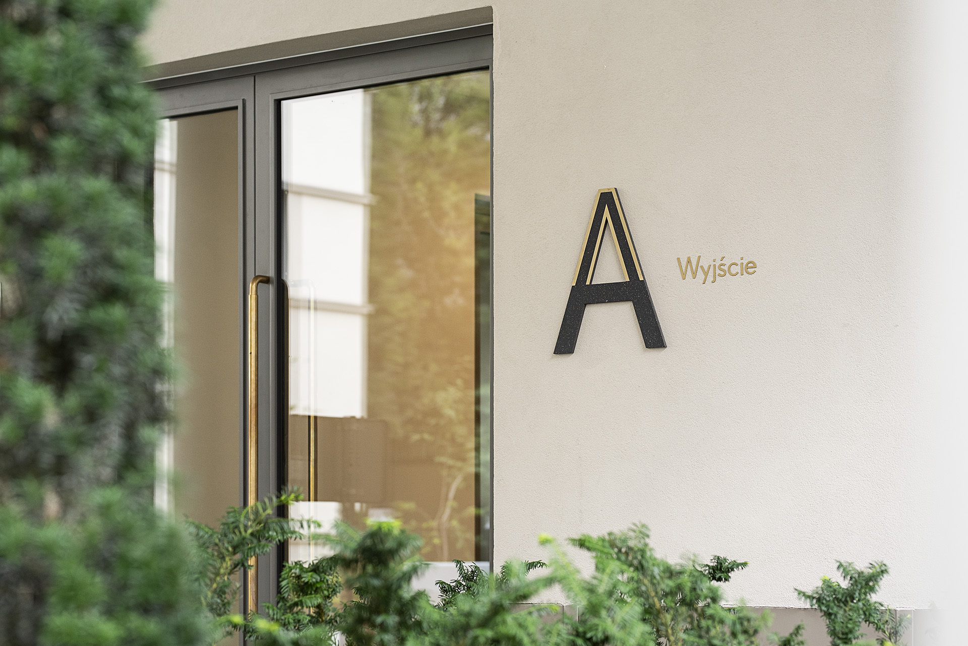
The main idea behind the signage system we prepared was to make a subtle reference to the architectural design. The system was to blend in with the existing space and harmoniously interact with it – hence the choice of leading materials and forms. The colour scheme of the media is quite limited, the system is based on three colours – white, black (shades of Corian® with a terrazzo pattern) and brass sheet. For all typographic messages, we used the typeface FF Super Grotesk Regular designed by Svend Smital (published by FontFont). This also became the basis for the design of the original letters and numbers used to label the individual buildings and floors.


