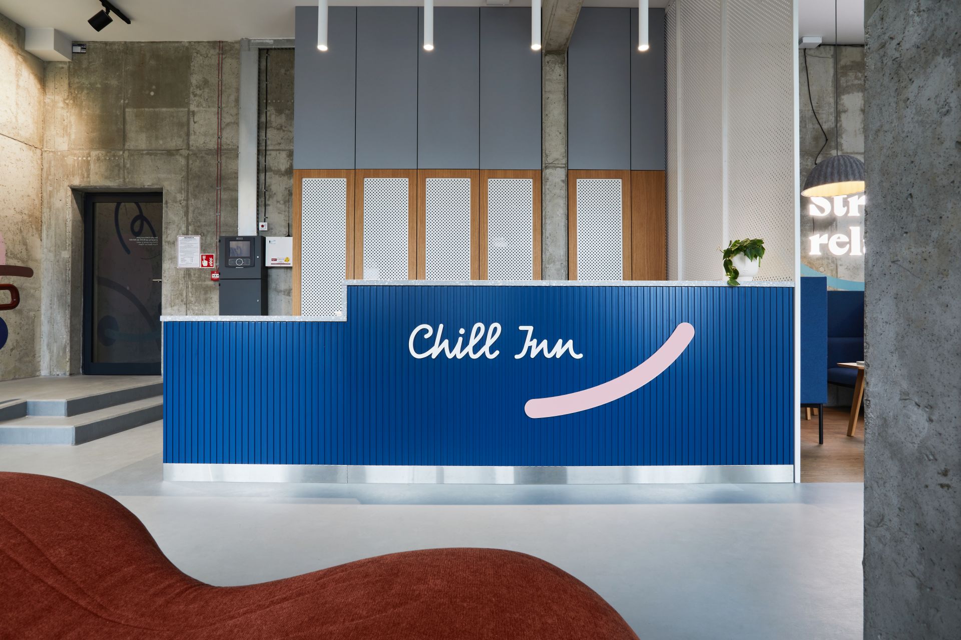
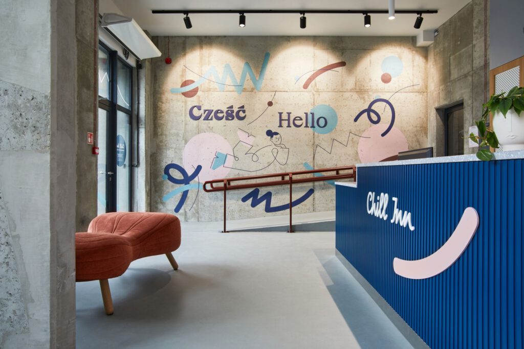
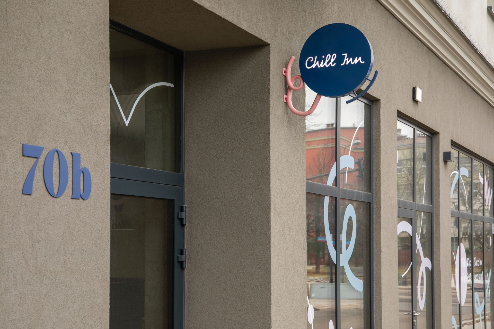
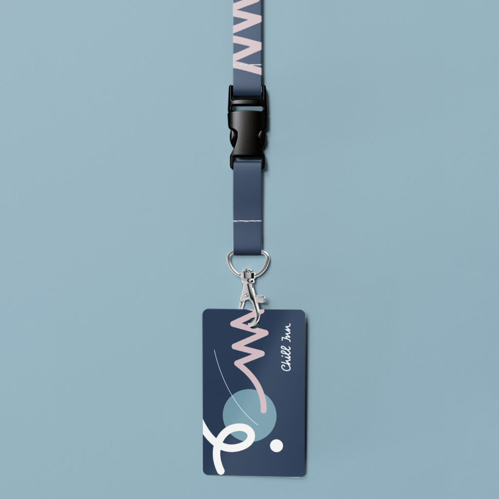
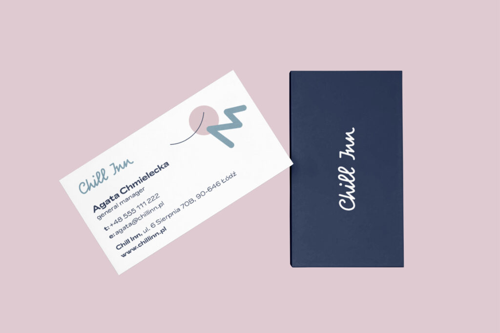
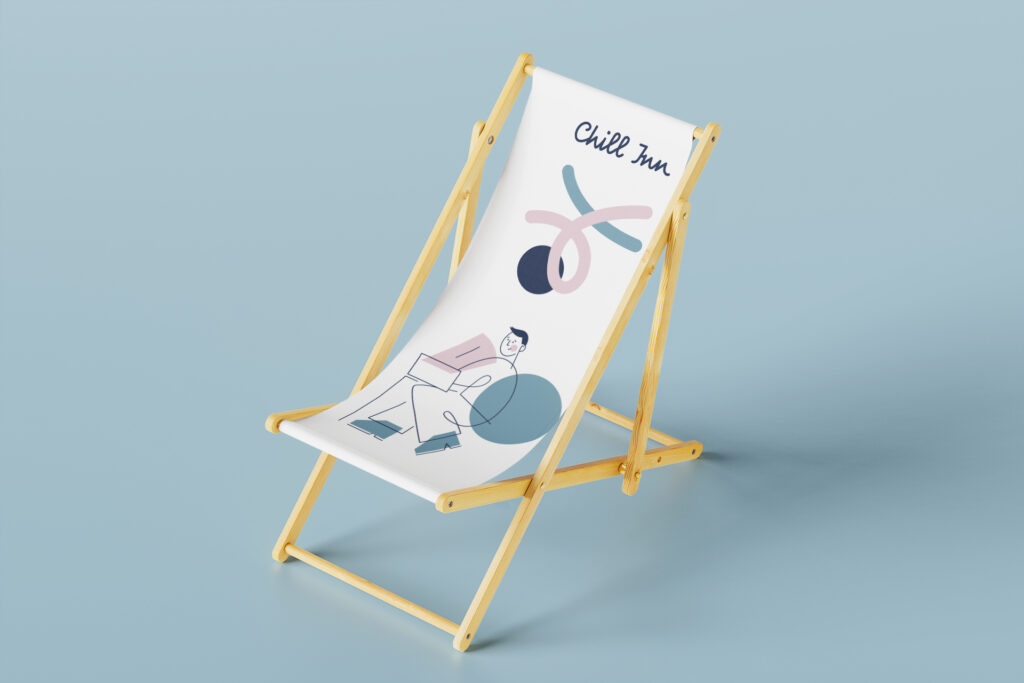
Chill Inn is a private student dormitory in Łódź, for which we prepared both the wayfinding system, naming and stylistically matching branding. Student life is associated with joy and carefreeness – such values were important to us when we worked on naming and developing a coherent identity and wayfinding system for this place.
‘Chill’ is a word that in the Polish language is associated with relaxation, looseness and tranquillity. It is a word with international overtones that immediately evokes images of rest, comfort and a casual atmosphere. ‘Inn’, on the other hand, can suggest an establishment with the character of a cosy guesthouse or home that focuses on personalisation and hospitality. Together, they form a combination ideal for a place that offers not only comfort, but also a kind of ‘respite’ from the everyday. The same associations accompanied us during the development of the branding – the logo and accompanying illustrations are characterised by flowing, abstract lines, a sophisticated, pastel colour palette and playfully complement the various indoor and outdoor spaces. They create an atmosphere full of tranquillity and youthful looseness, which is in tune with the energy that emerges, but also with relaxation and harmony.

