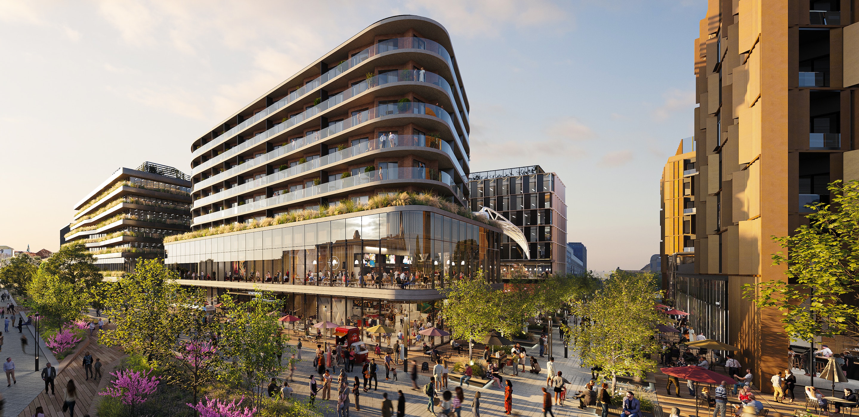
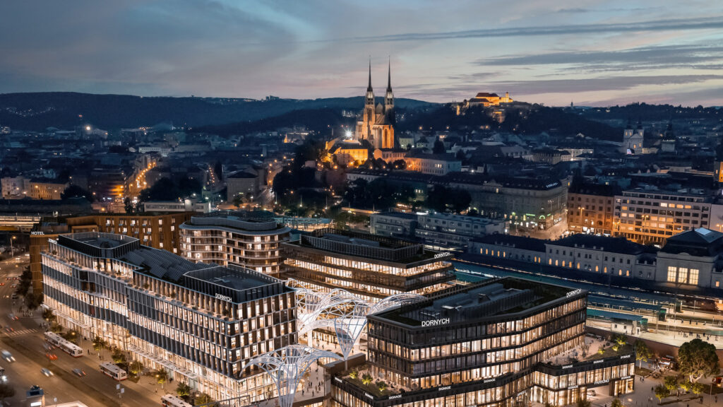
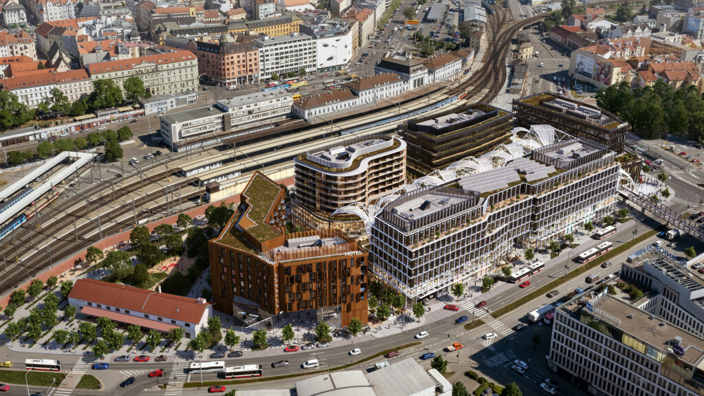
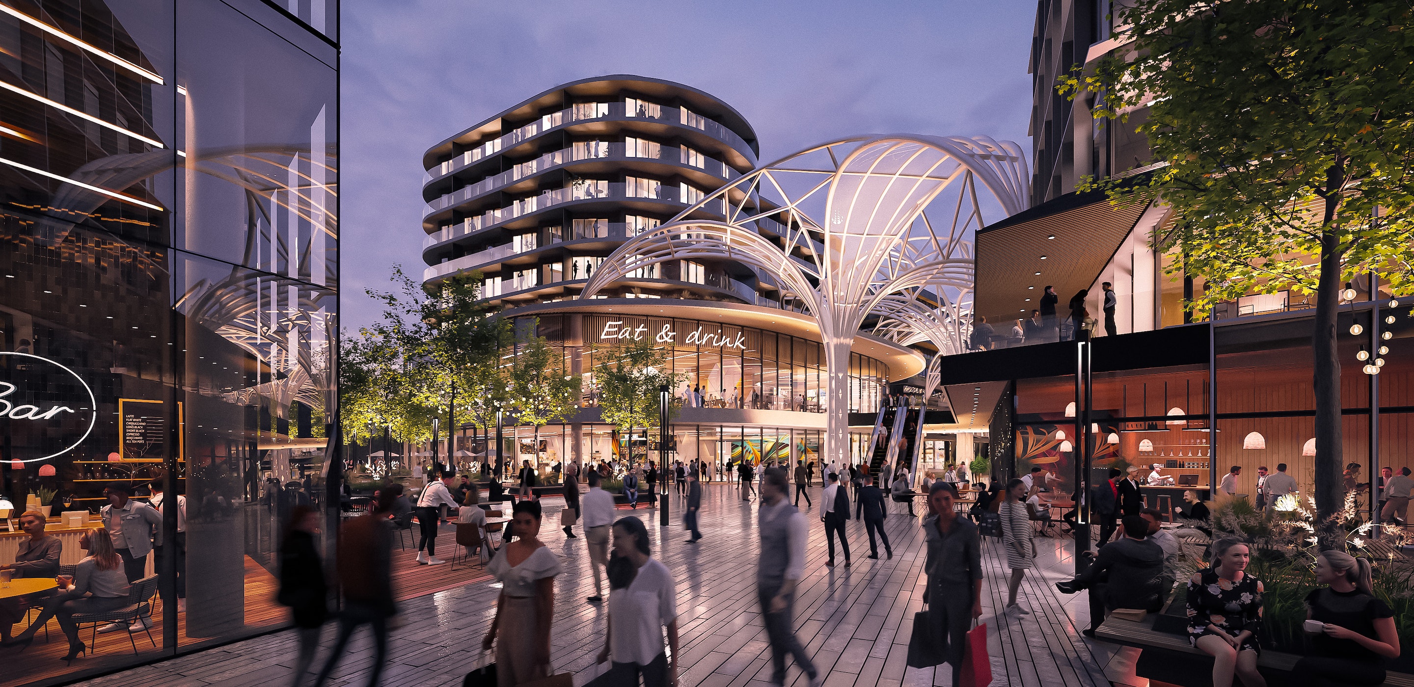
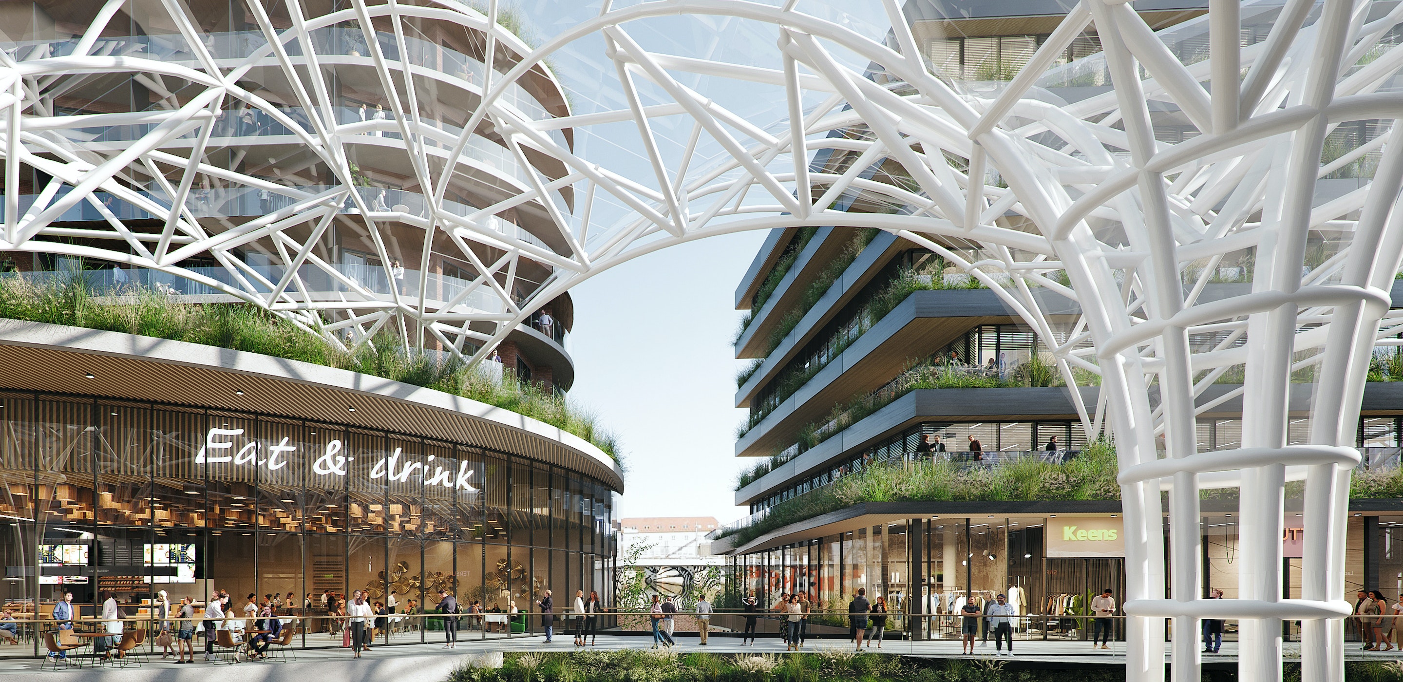
Dornych is a shopping and mixed-use centre located in Brno (Czech Republic). The plot is close to the city’s main railway station. The new multifunctional complex is designed to connect the historic old town of the city with the planned Southern Quarter. The project will involve the creation of retail and service space, offices, apartments, and 2.5 ha of green space between five smaller buildings.
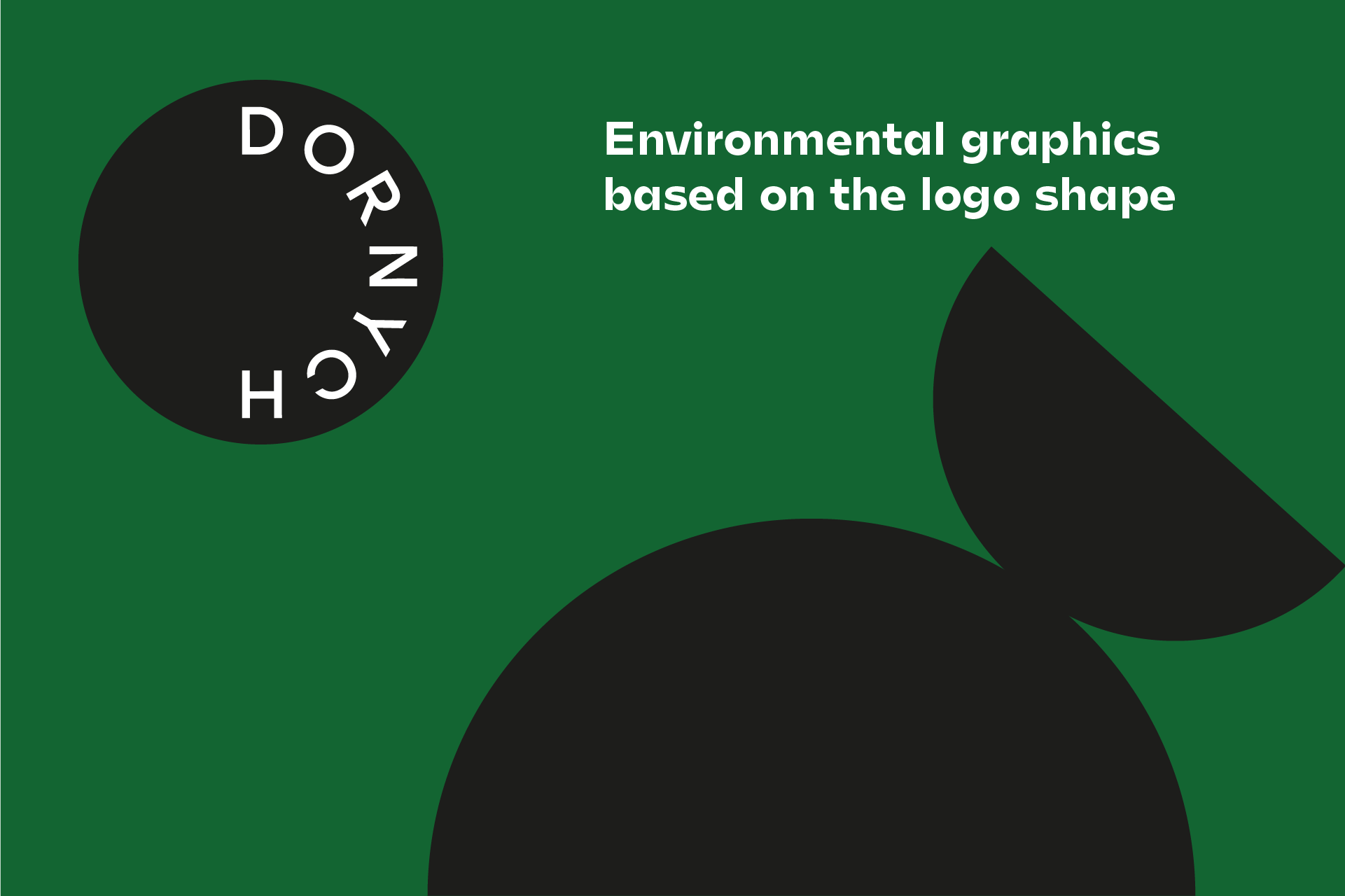
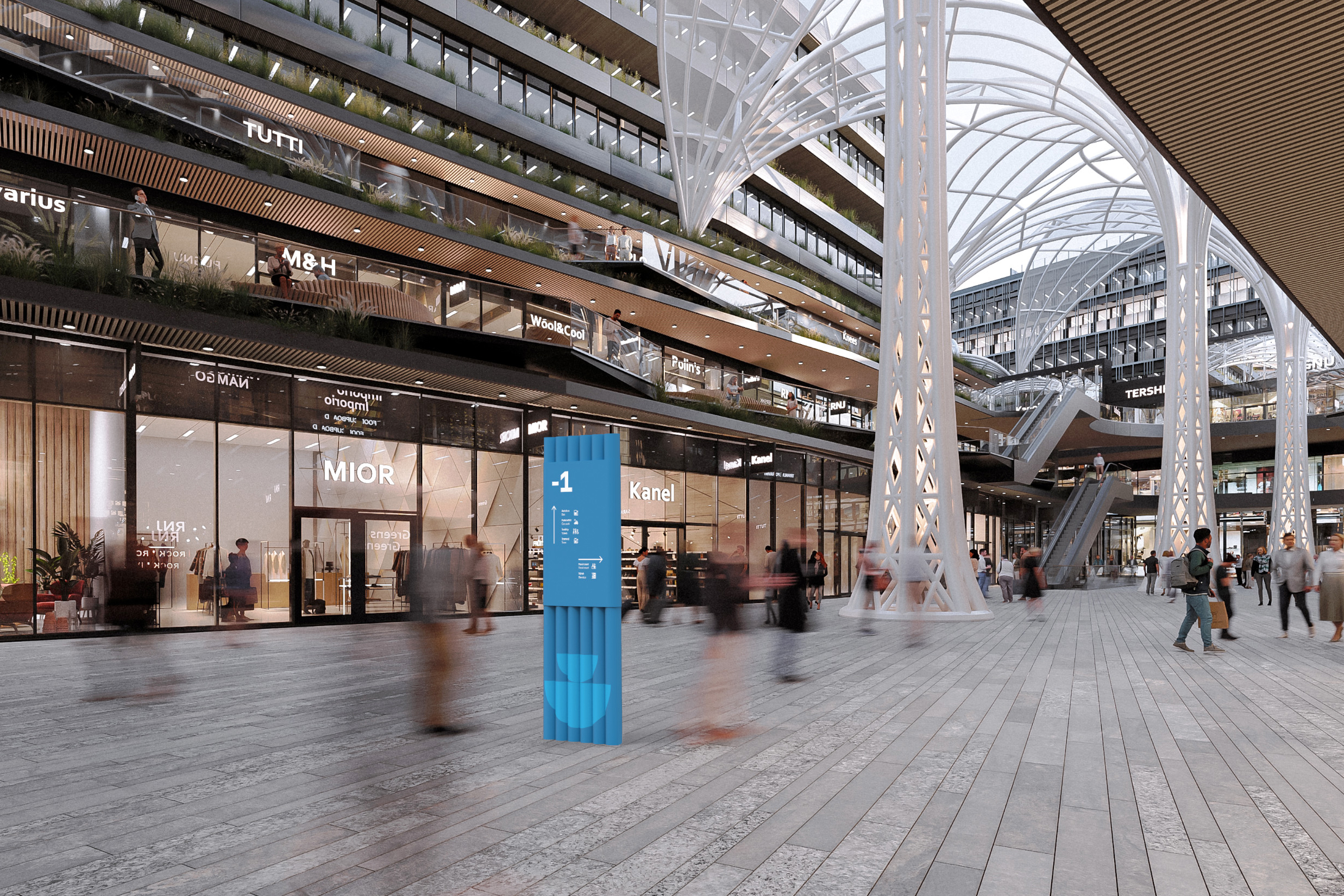
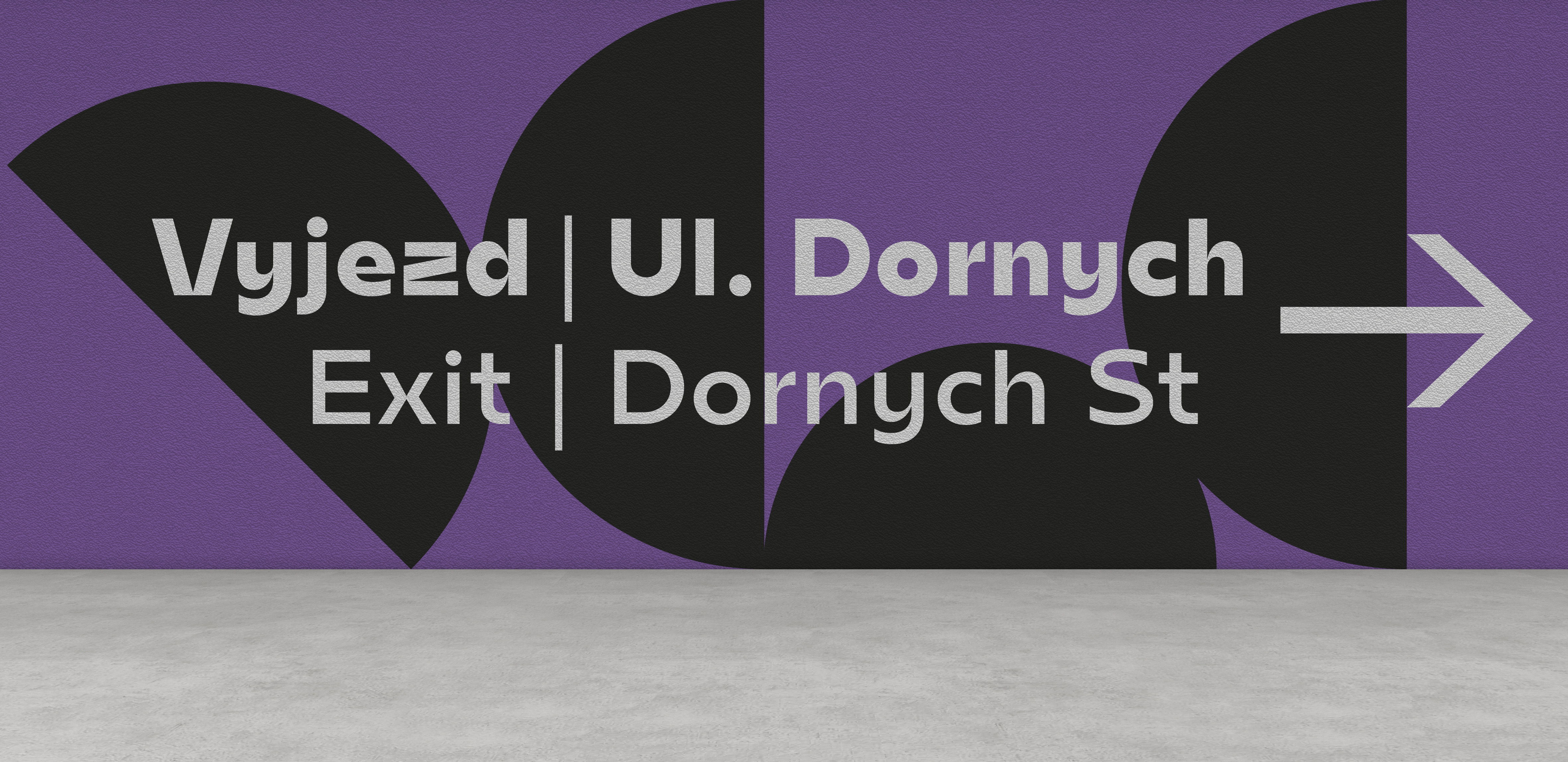
Firstly, the wayfinding we’ve prepared refers to the architecture of the investment. There are many oval elements and pillars with a circular base, that have been duplicated into the design of the information carriers. The signage and environmental graphic design is also inspired by a Dornych branding which is playful, minimalistic and modern. This connection will create an aesthetically coherent message. Dominant colors, appearing also in brand messages, will stand out in the space and serve as reference points for users.
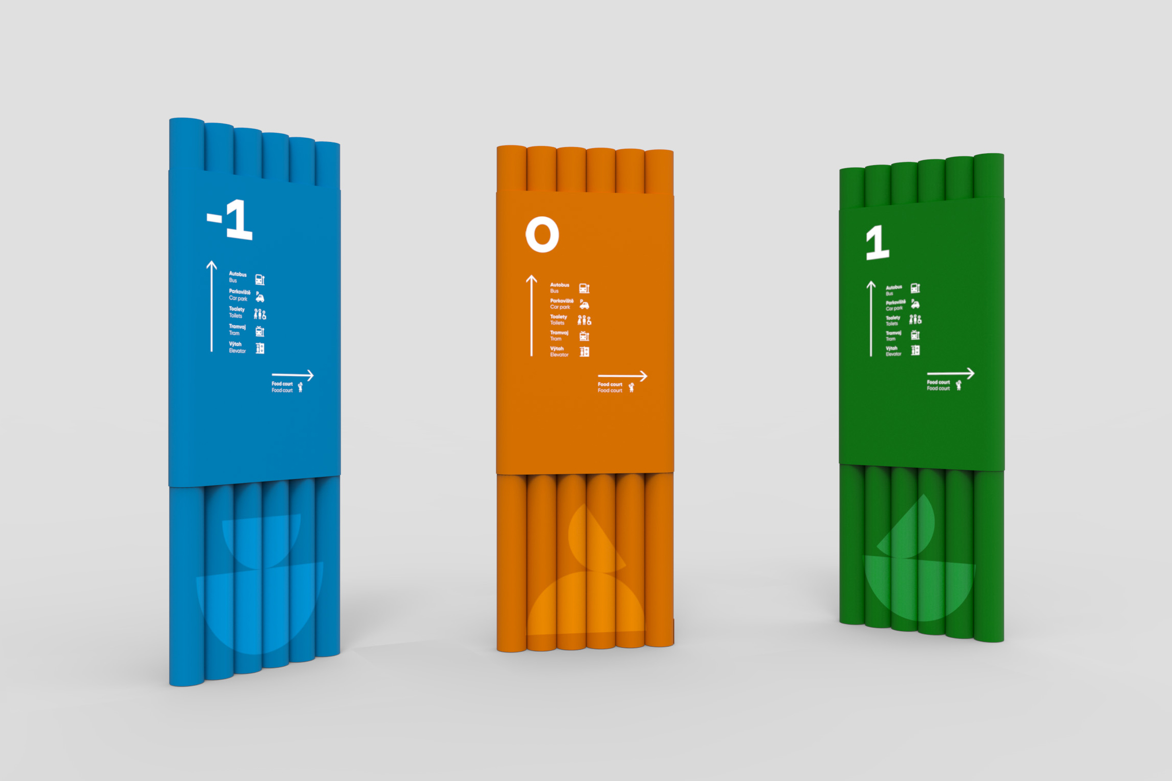
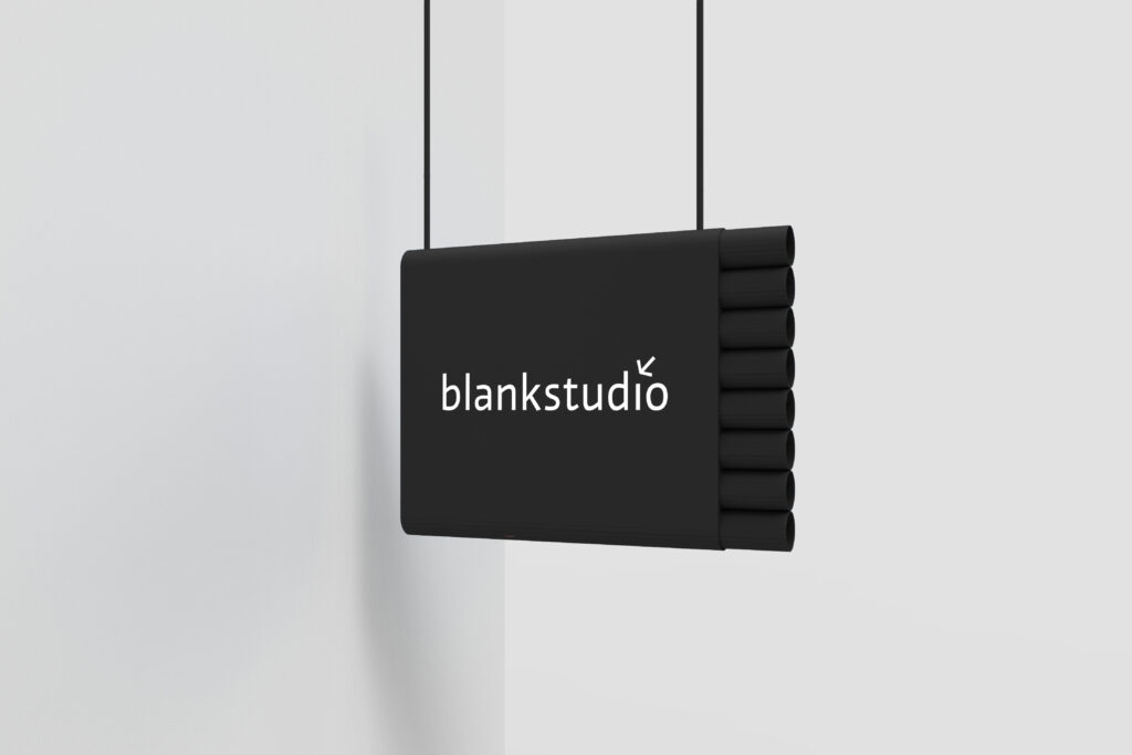
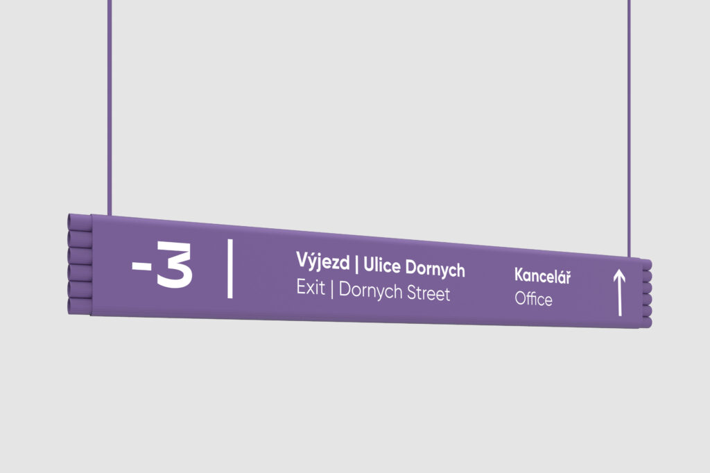
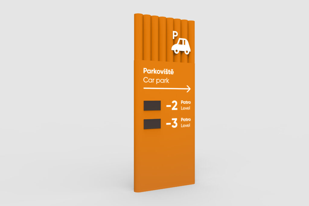
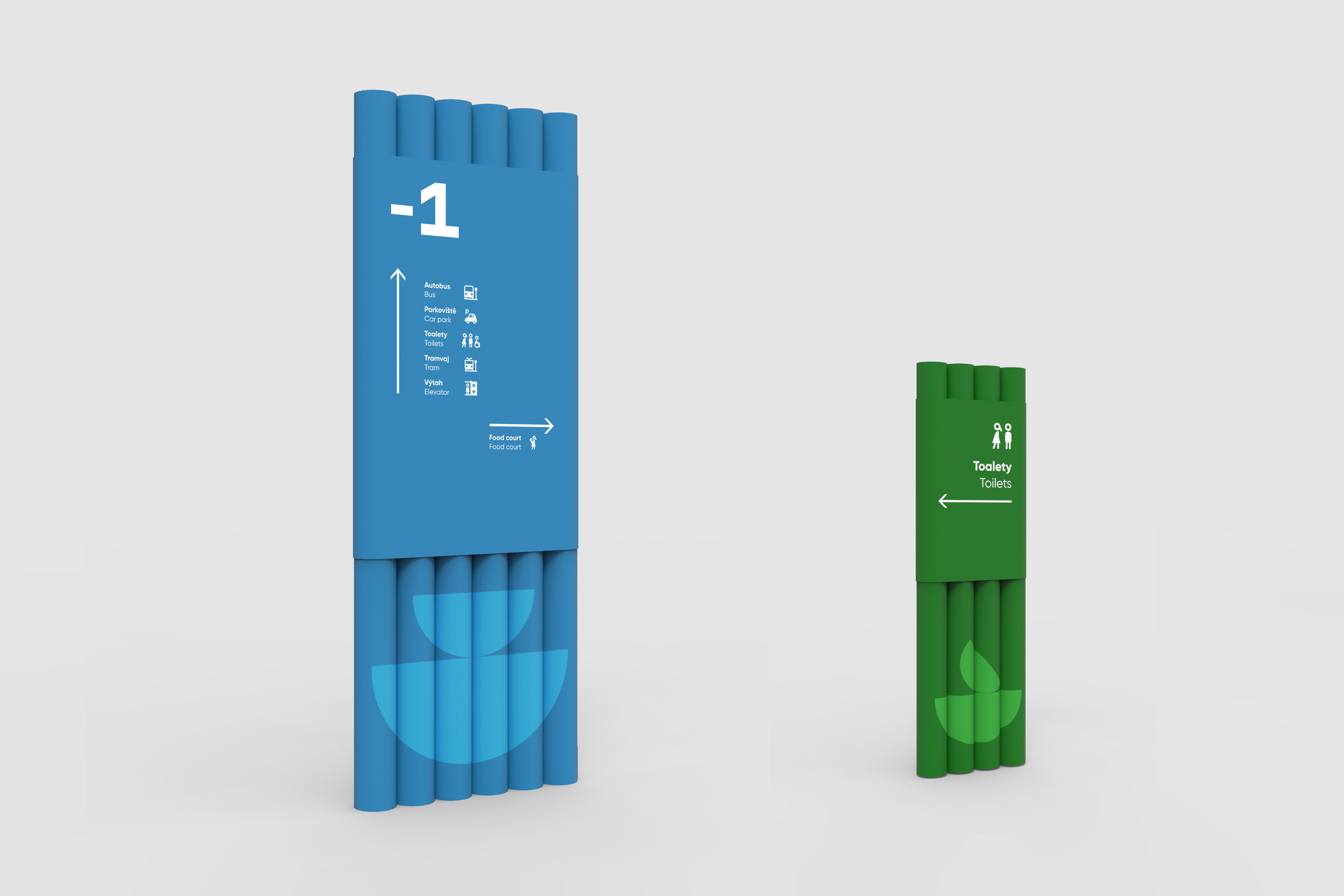
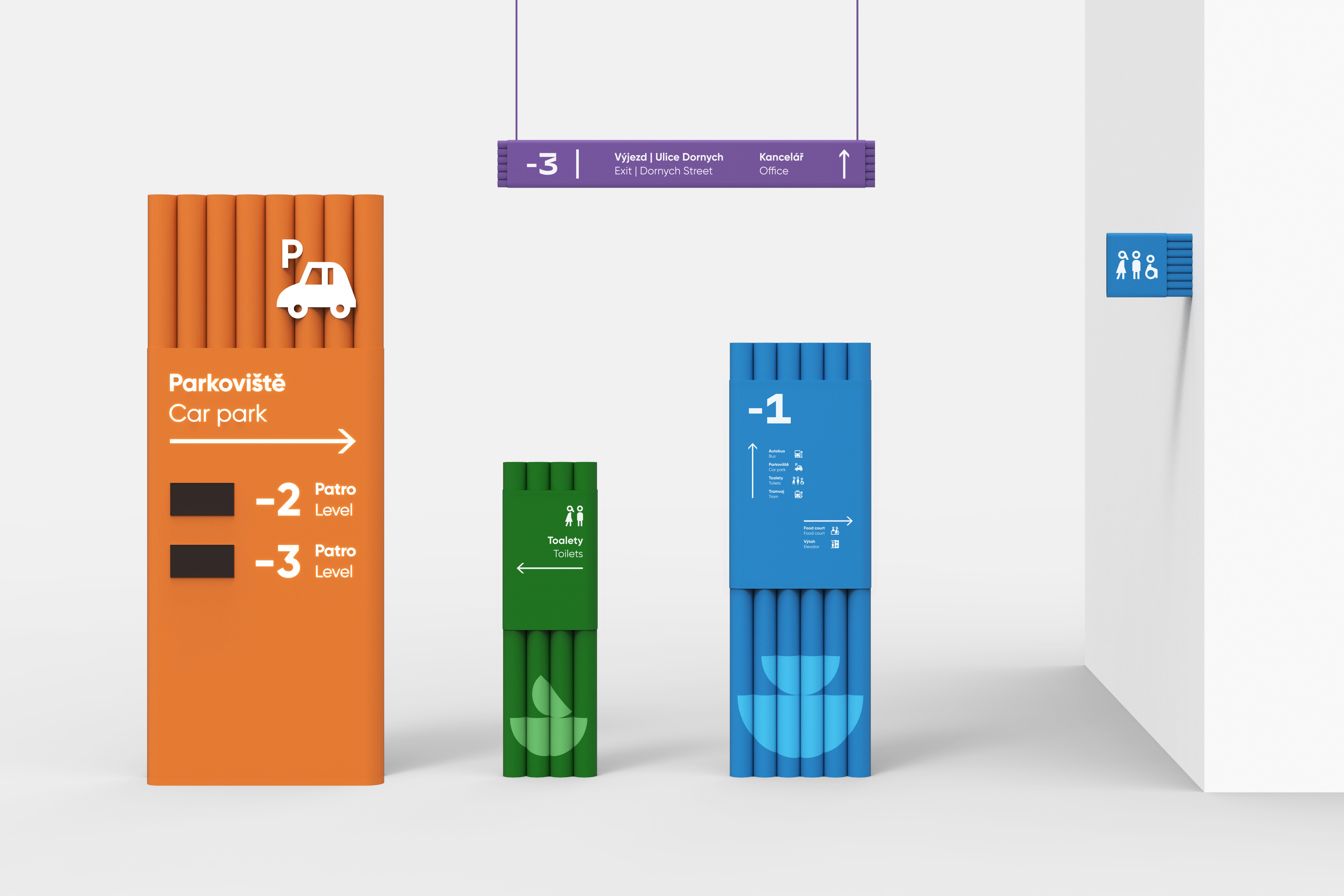
The main information carriers are made of painted industrial pipes. They are linked together with an aluminium band with directional information. The carrier is oval but still unique and legible. Geometric branding graphics and colors of carriers are assigned to each floor. The exception is the garage where, due to the possibility of using larger painted compositions on the walls, the shapes are varied.
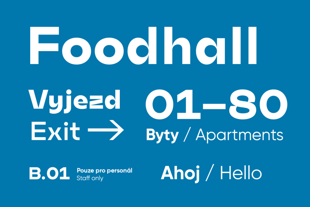
For the signage system, we used 2 complementary typefaces: Mohol and Gilroy.
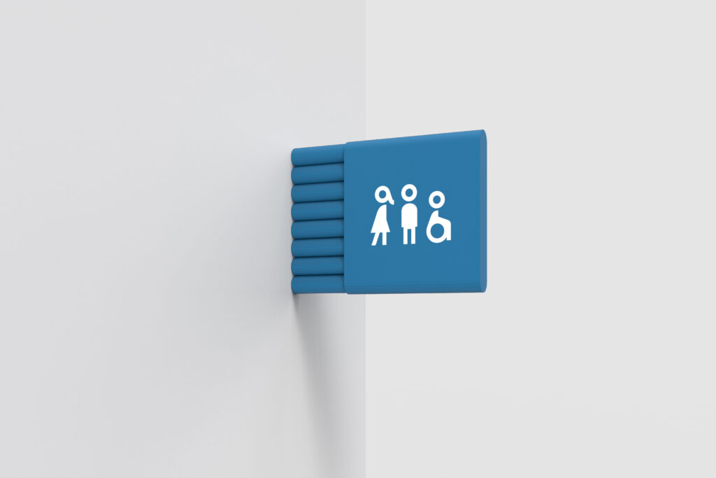
System includes also a personalized set of pictograms. The icons are coherent with the Gilroy typeface – their shapes refer directly to the elements of the letters.

