When we began working together with Workplace on the Lipton Teas and Infusions Global Services Hub in Katowice, the brand was already undergoing a profound transformation. Lipton was redefining itself – shifting from a traditional tea company into a vibrant, lifestyle-driven brand that speaks directly to younger generations.
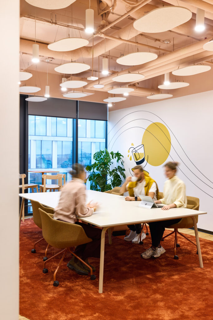
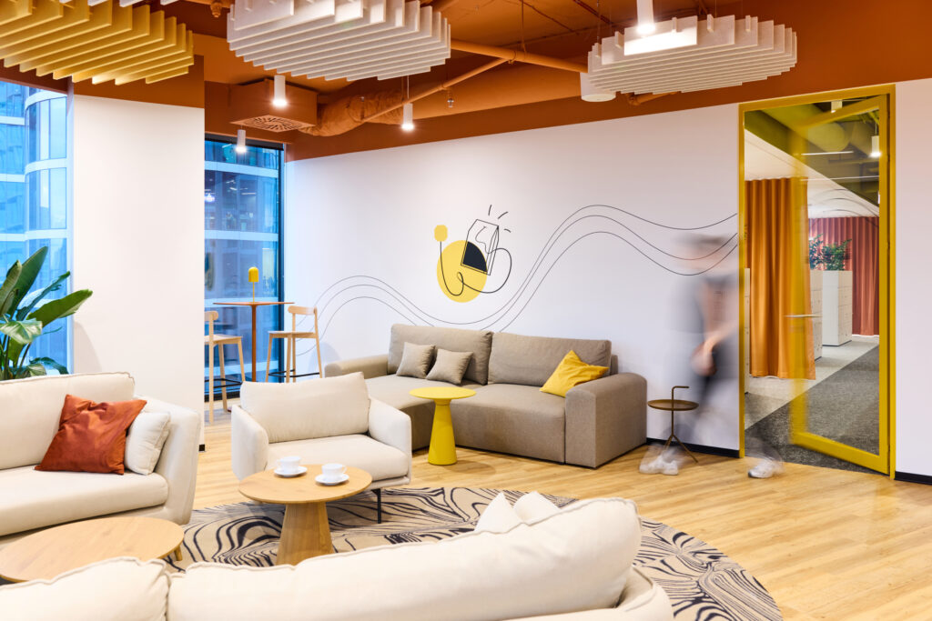
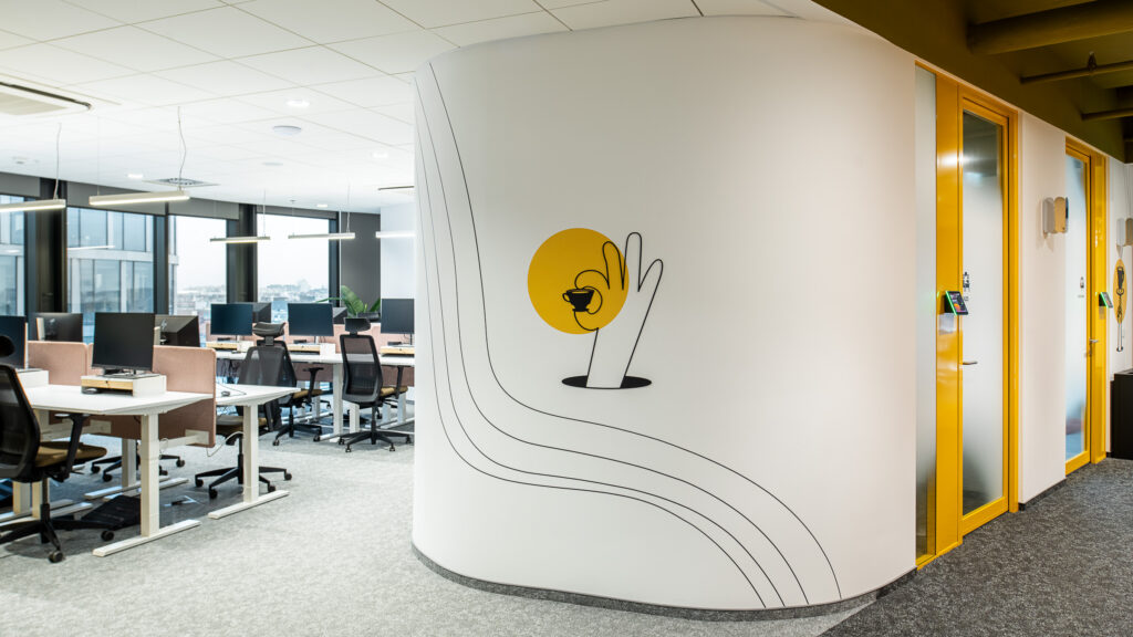
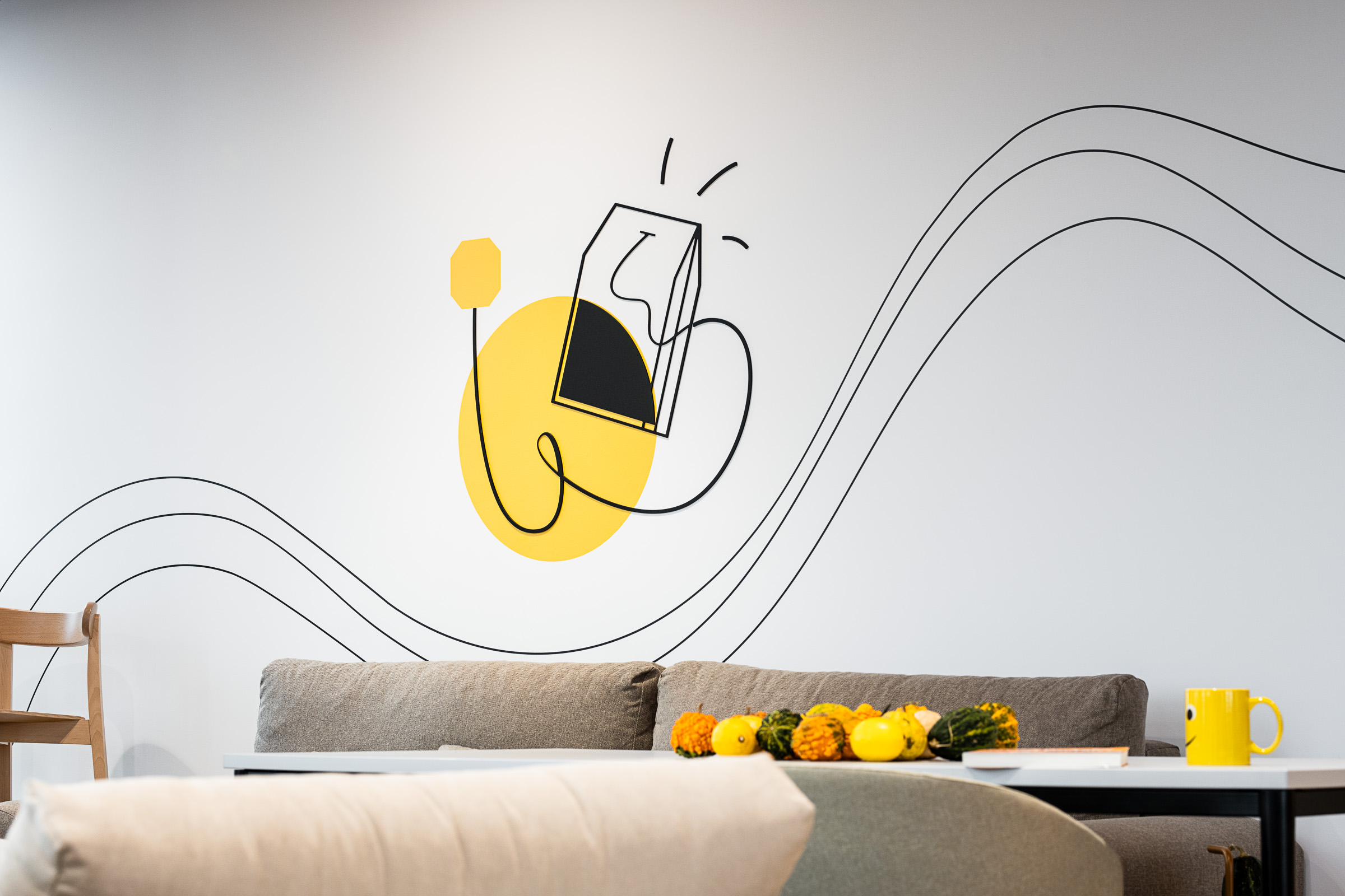
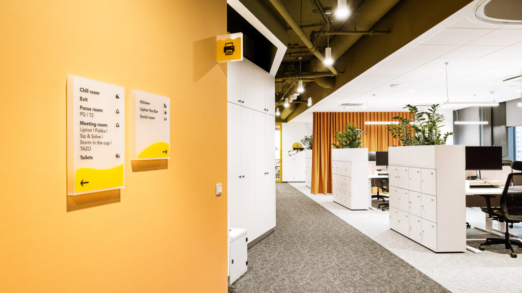
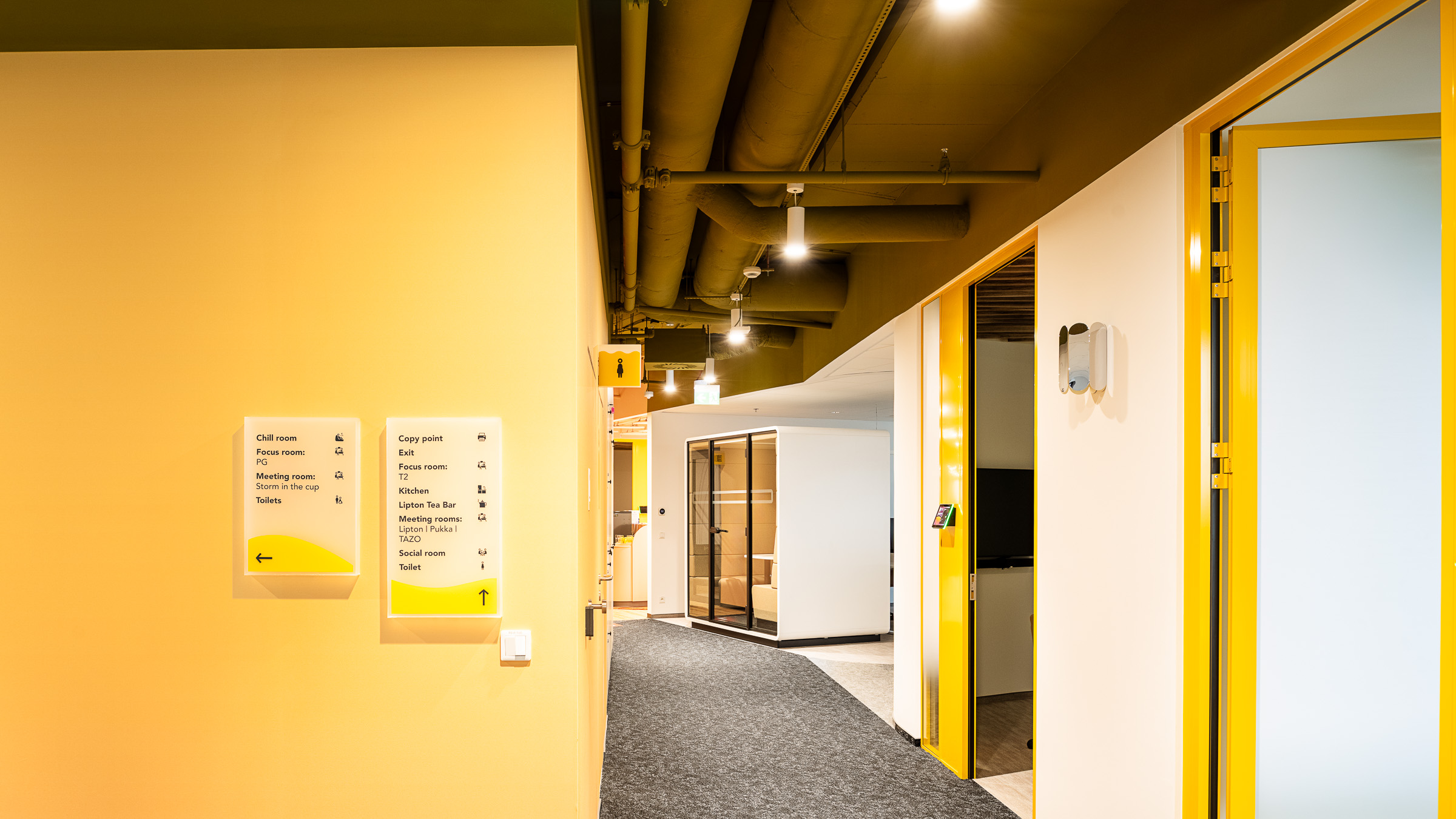
The visual language of the office – including the signage and wayfinding system – draws directly from three key sources: the tea brewing process, expressed through gradients, transparency and layering, the colours and flavours associated with Lipton’s hot and cold beverages, soft curves and natural textures.
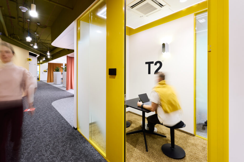
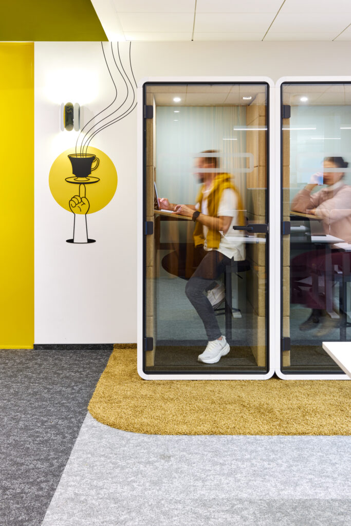
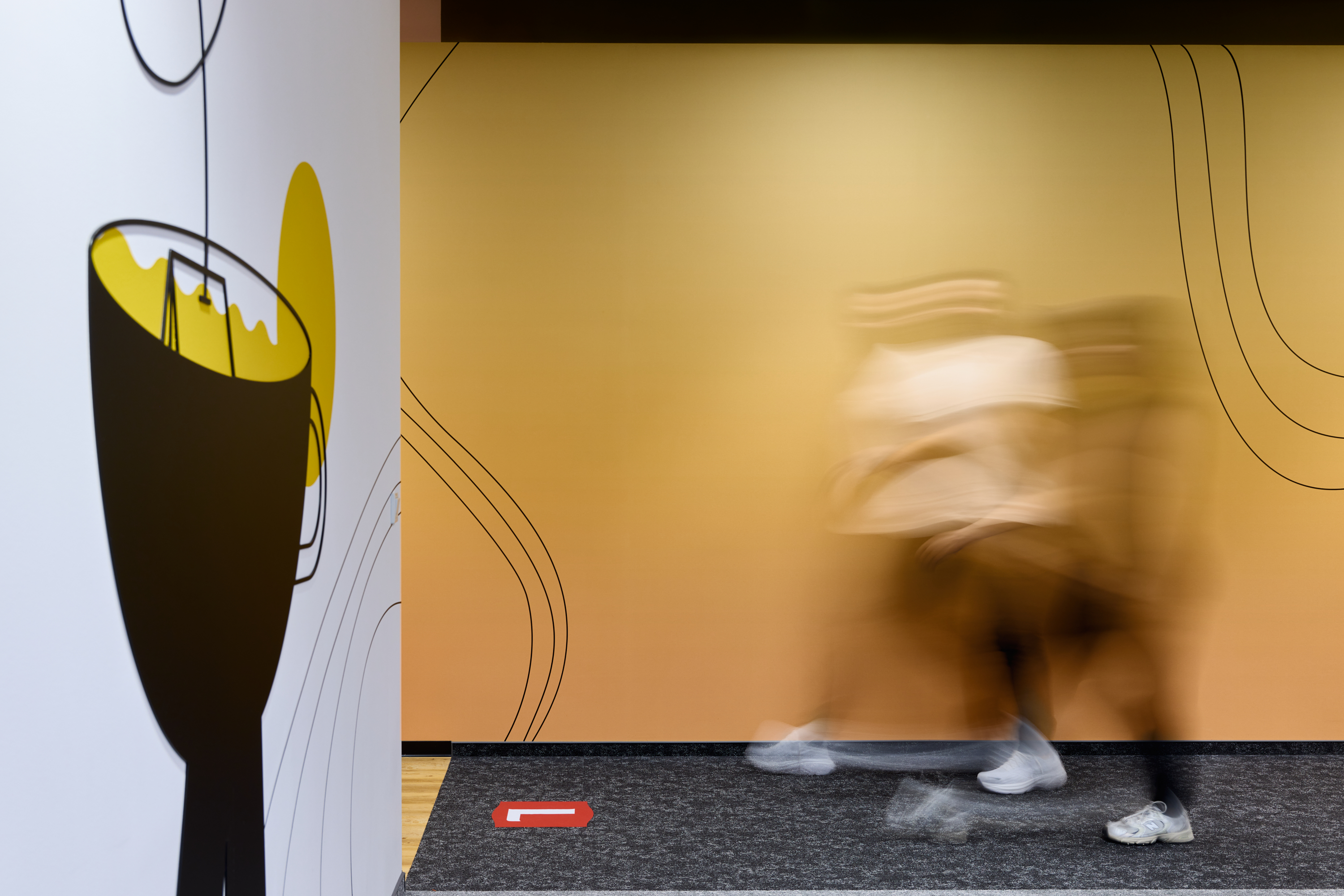
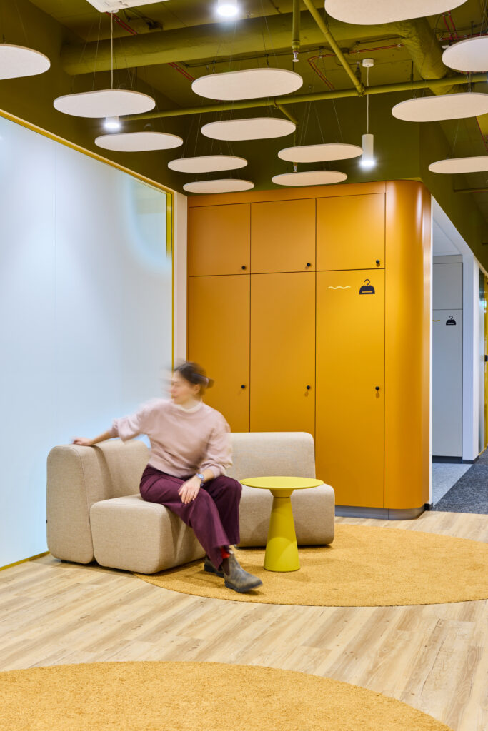
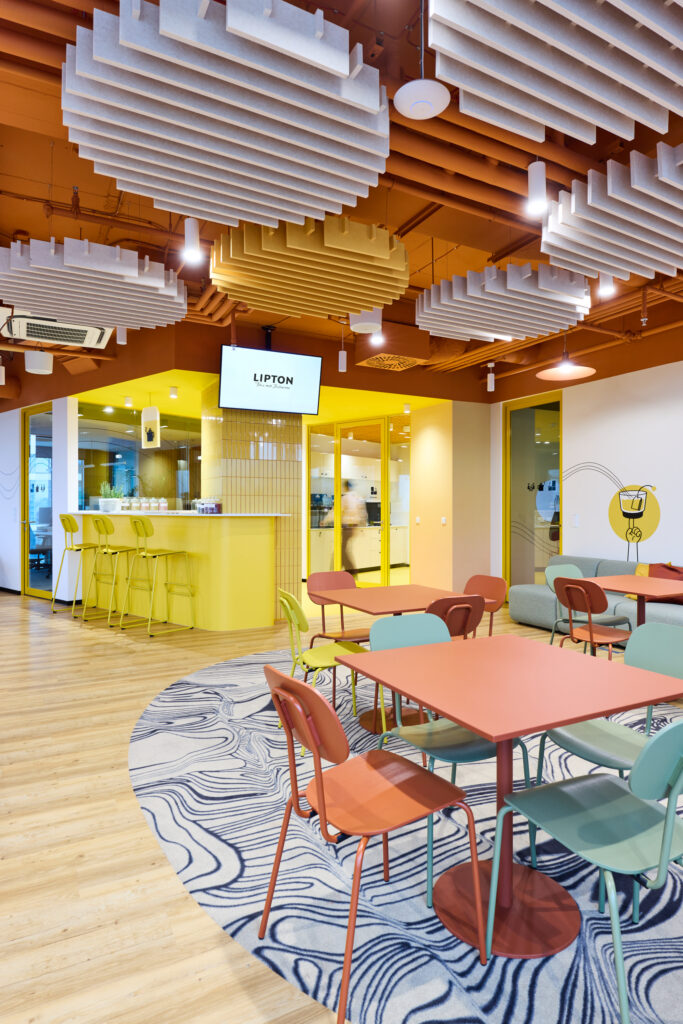
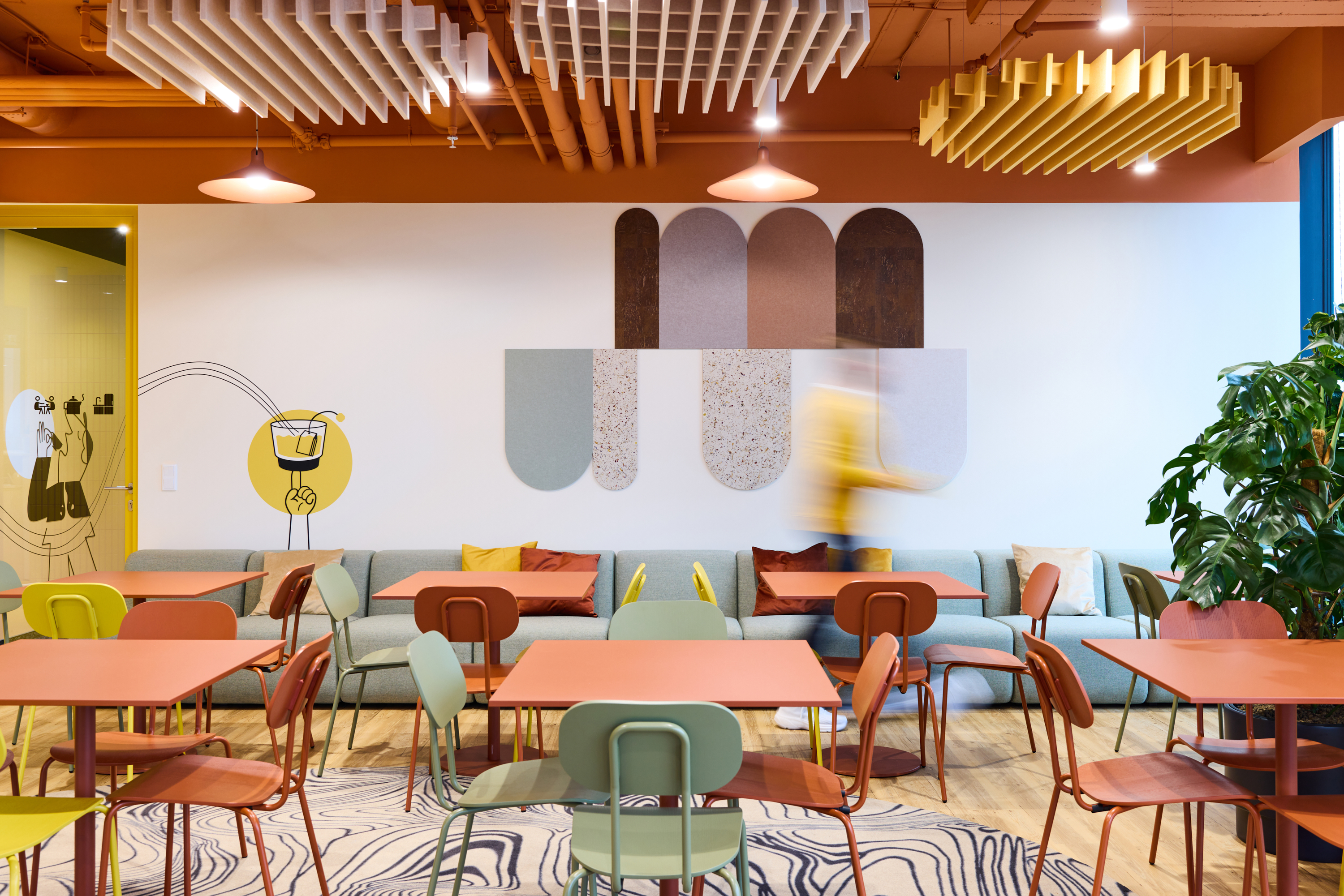
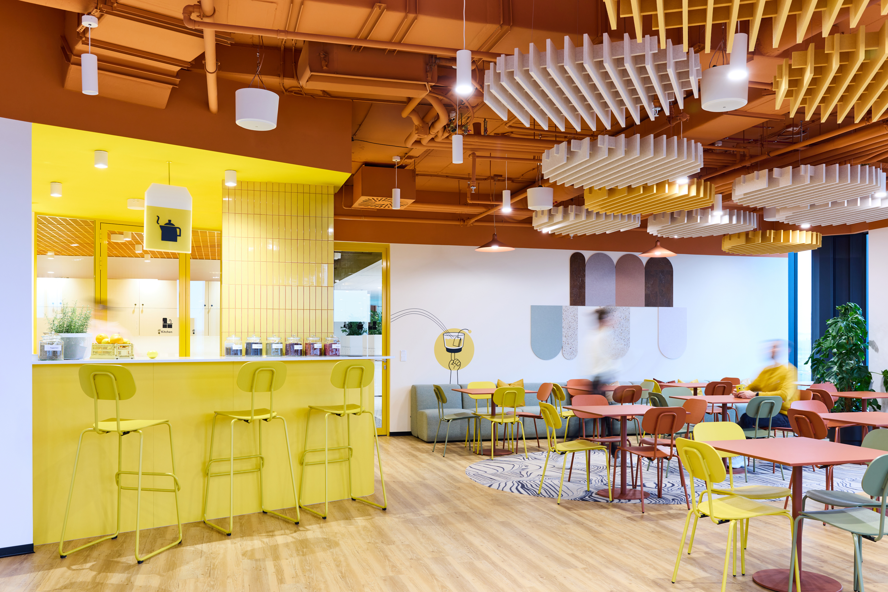
Gradients and warm colours are a fundamental design tool throughout the space. They appear not only on walls, but extend seamlessly into furniture, ceilings, lighting and environmental graphics, allowing colour and material to flow organically and reinforce spatial orientation. This continuity helps users intuitively understand where they are within the office and how different zones relate to one another.
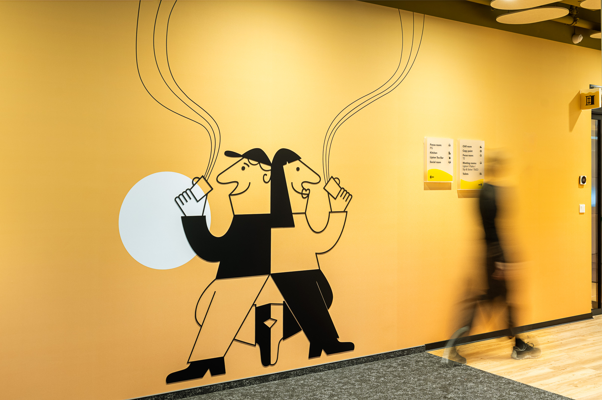
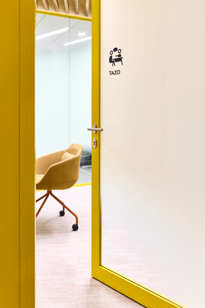
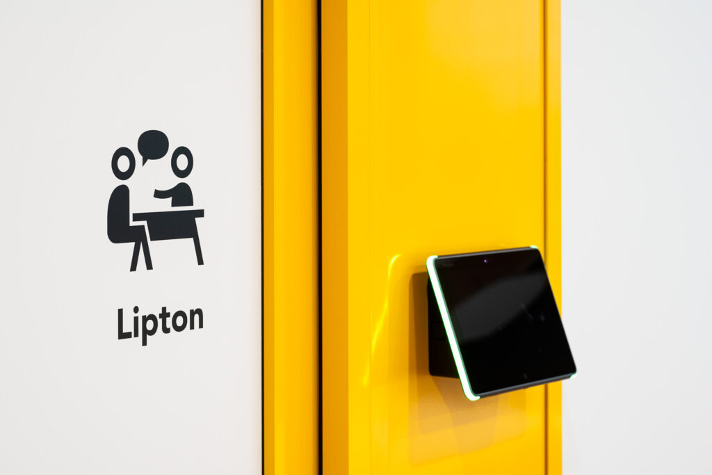
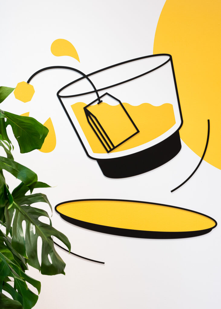
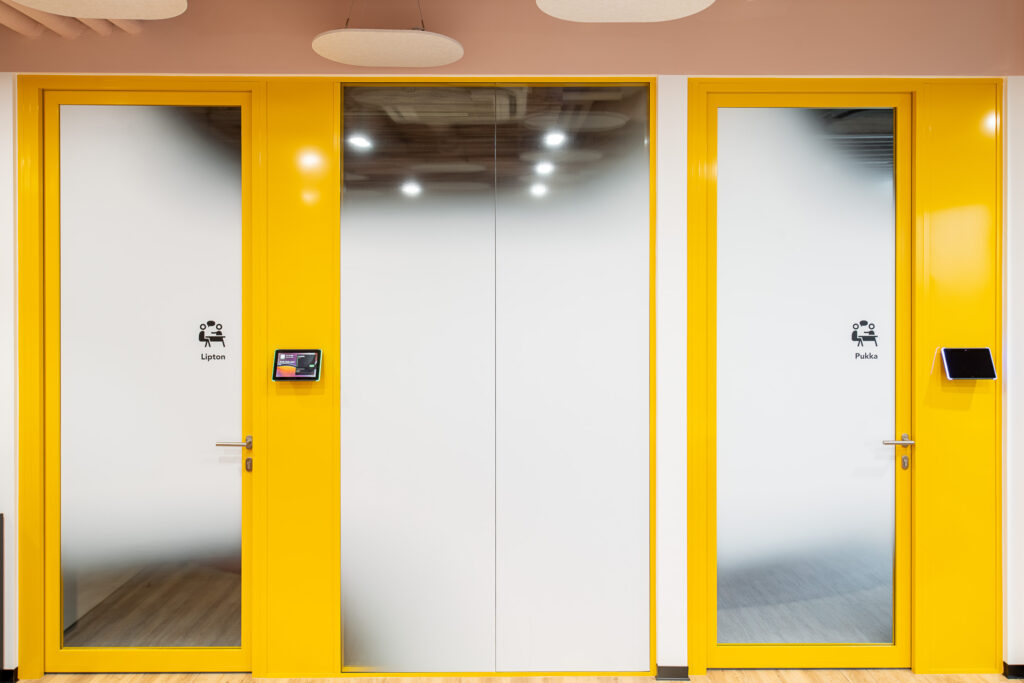
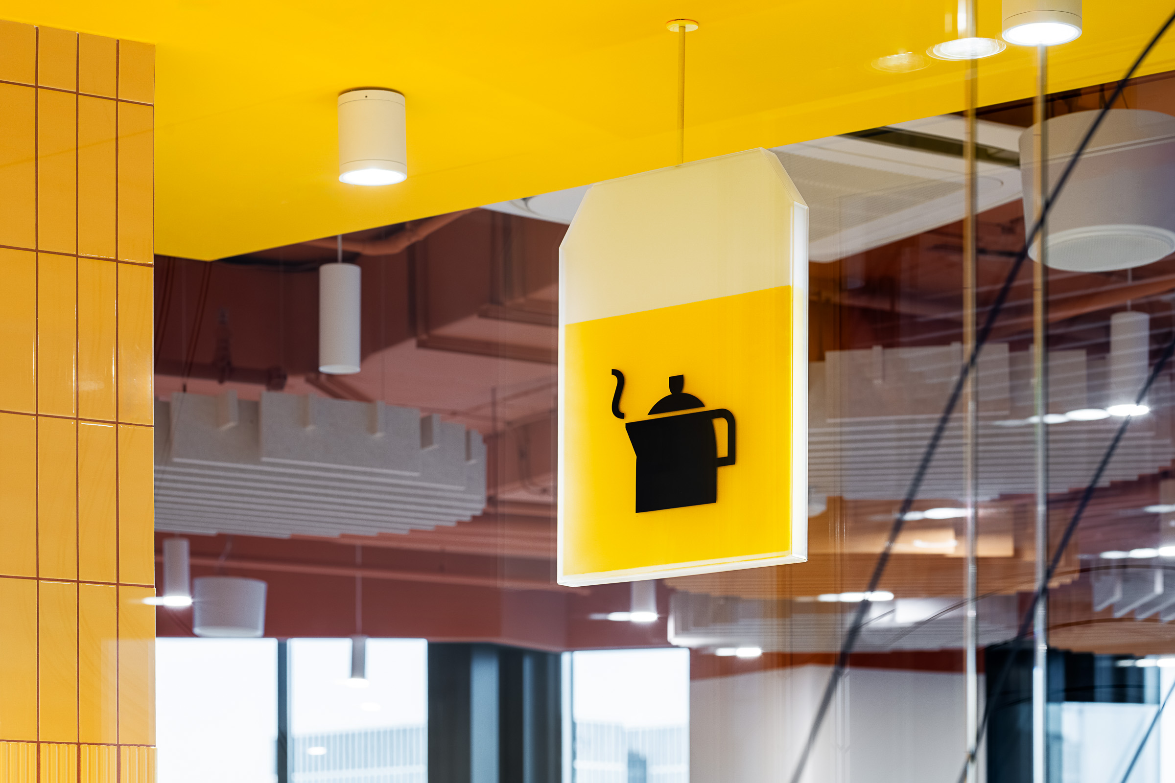
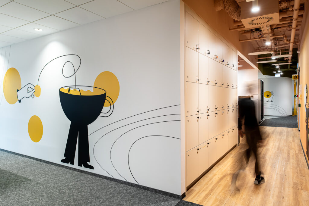
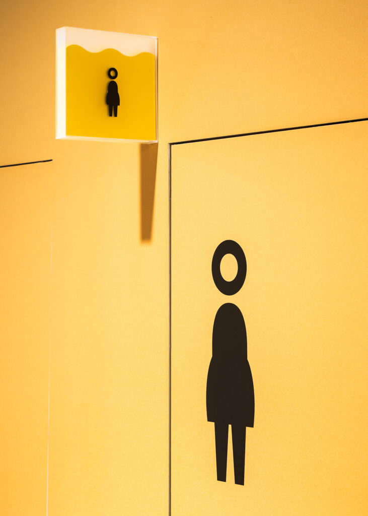
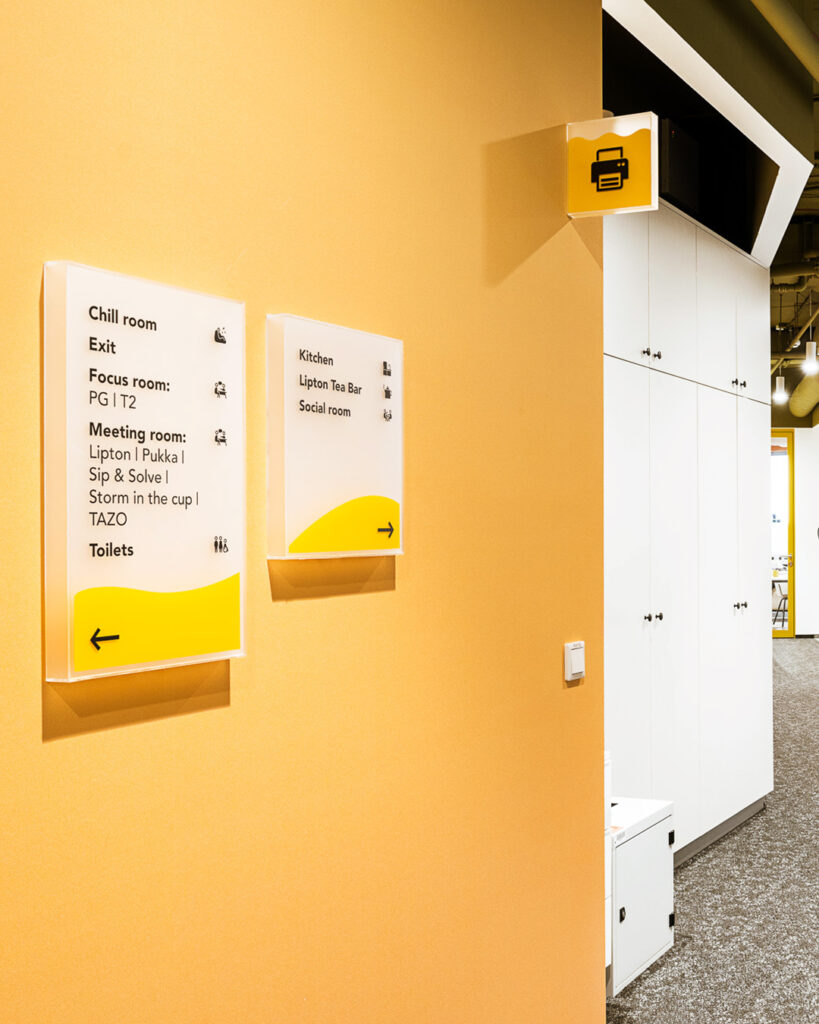
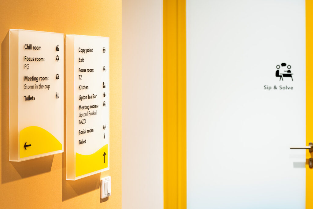
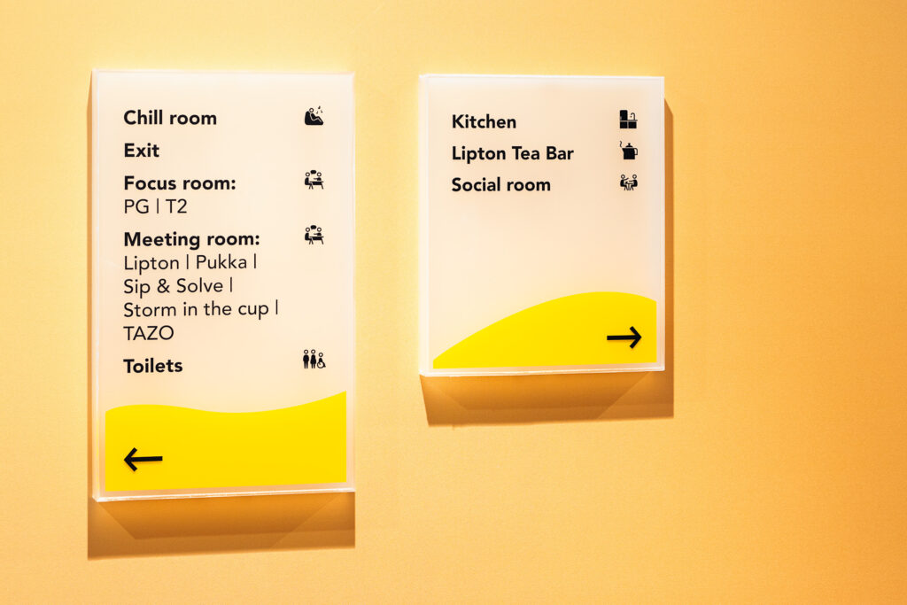
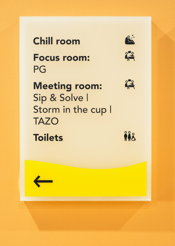
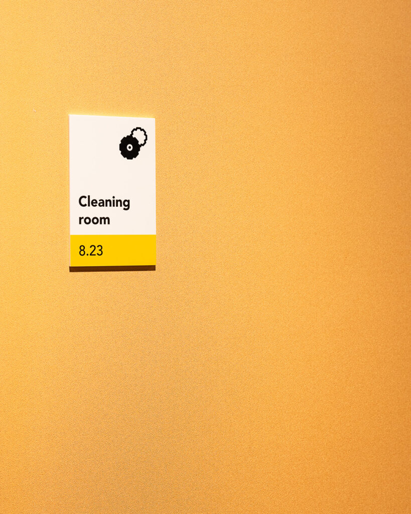
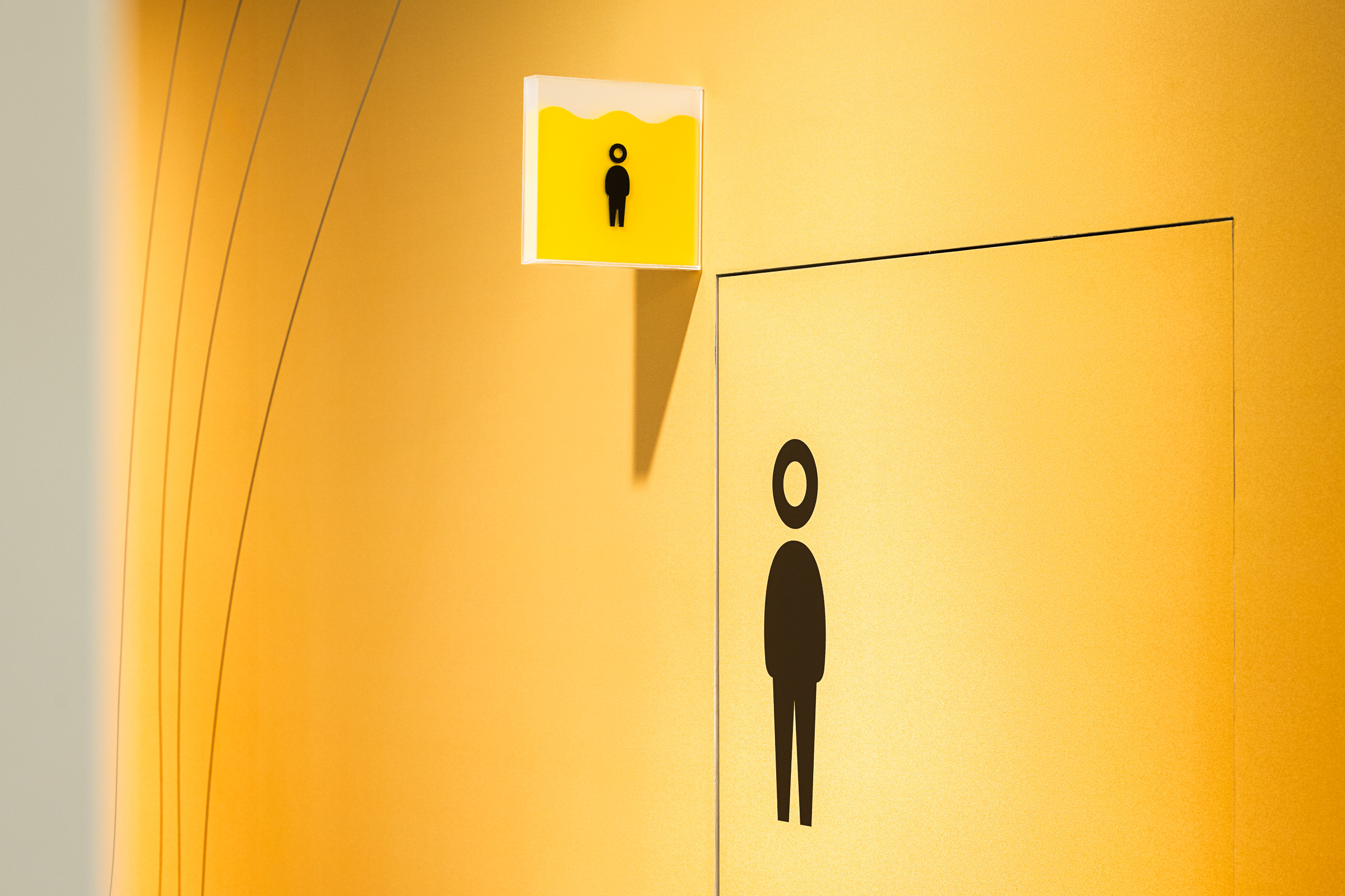
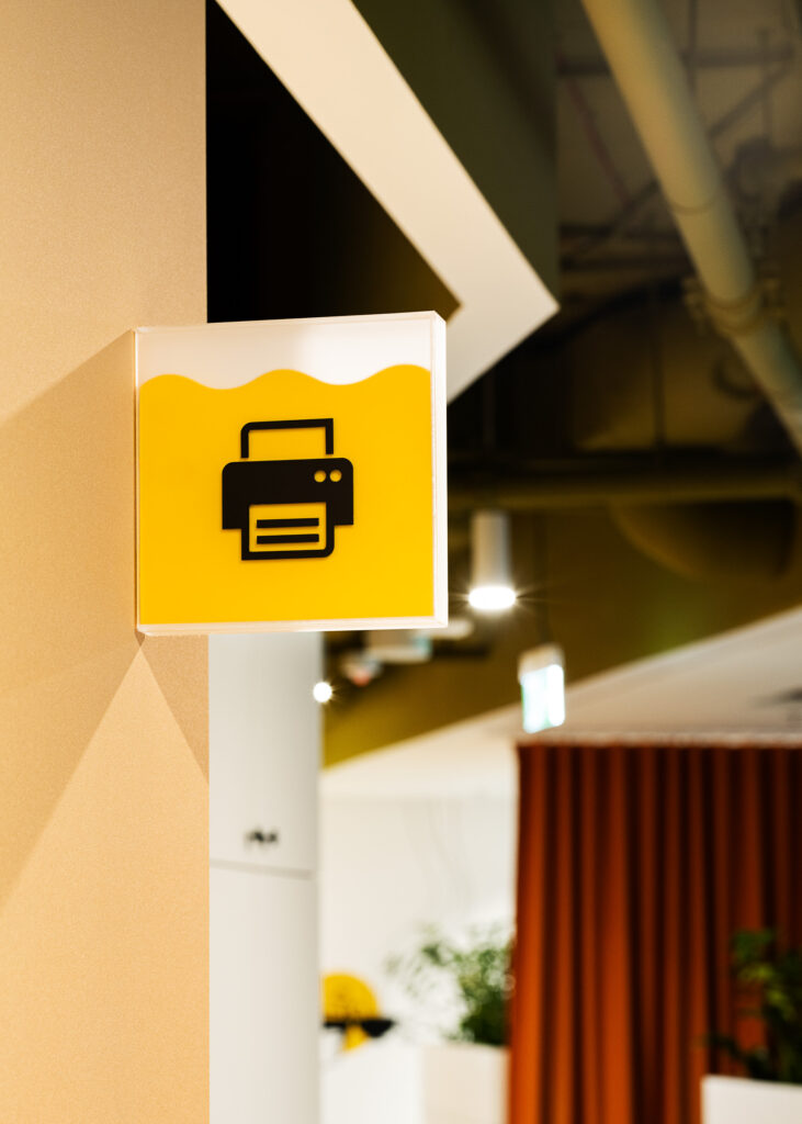
A distinctive element of the signage system is the information carriers themselves. Their simple, geometric forms have been enhanced through three-dimensionality – plexiglass “containers” appear as if they were filled with liquid. This solution directly references the essence of the Lipton brand and the tea infusion process, visually echoing transparency and colour saturation.
The effect reinforces the idea of flavour, freshness and fluidity, while allowing light and gradients to interact with the signage, changing its appearance depending on perspective and time of day. As a result, the signage becomes more than a functional layer – it transforms into an integral, sensory element of the interior.
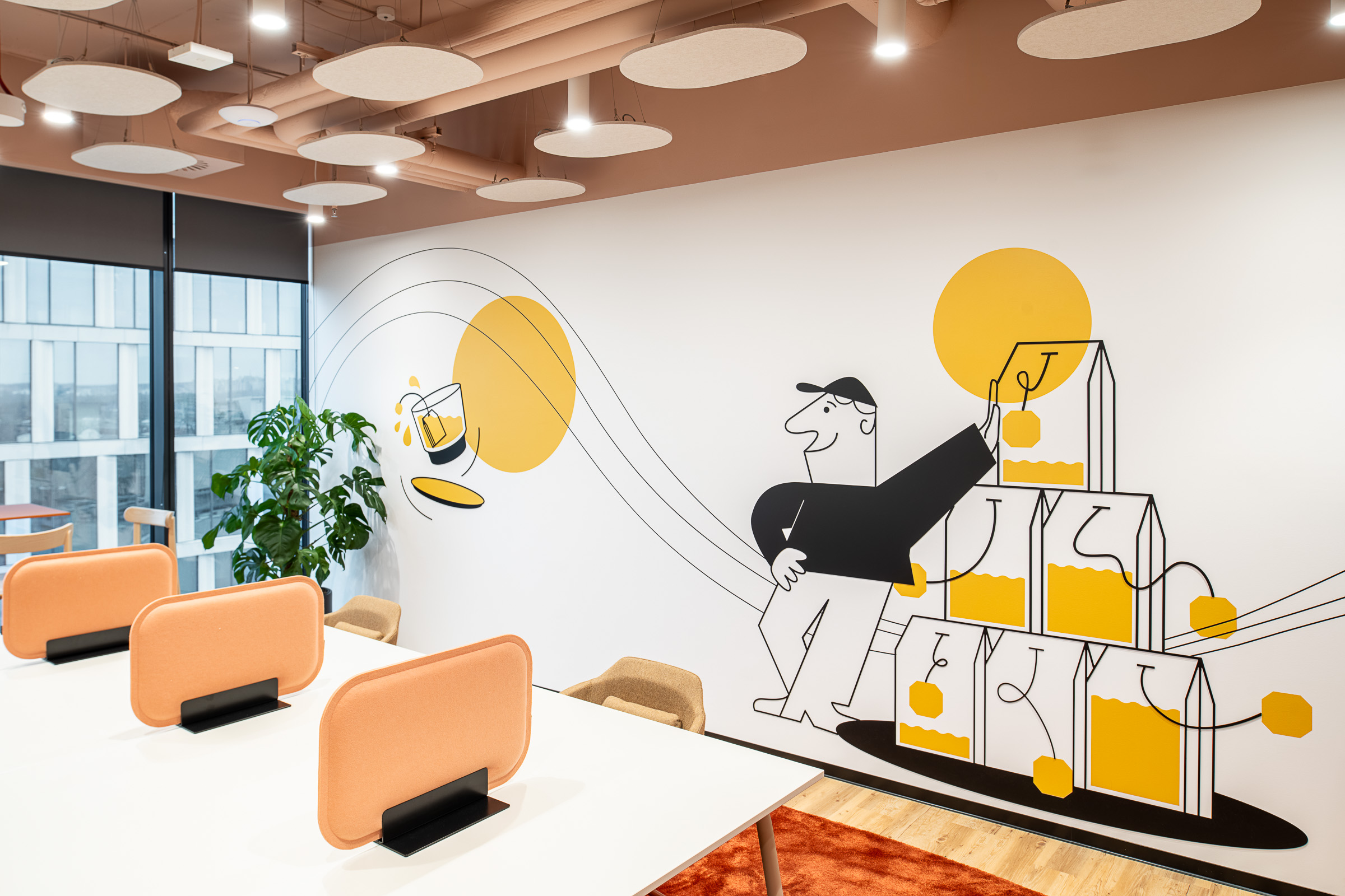
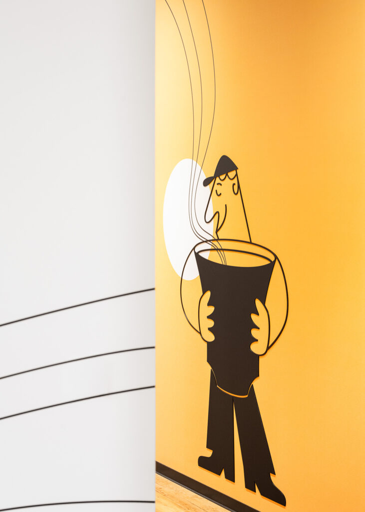
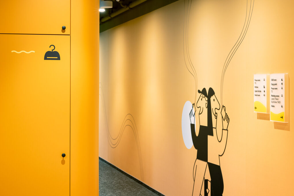
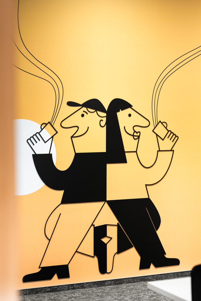
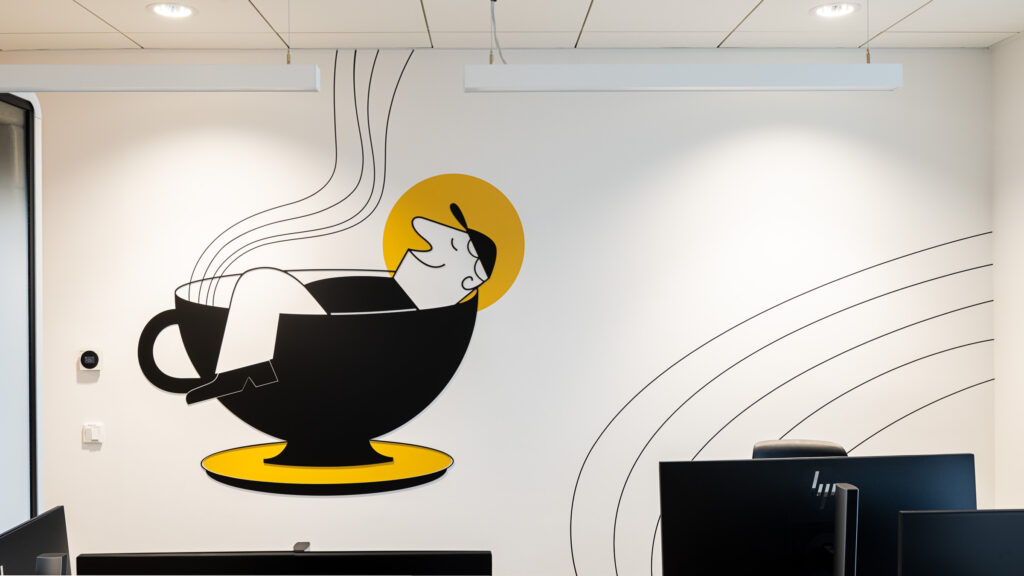
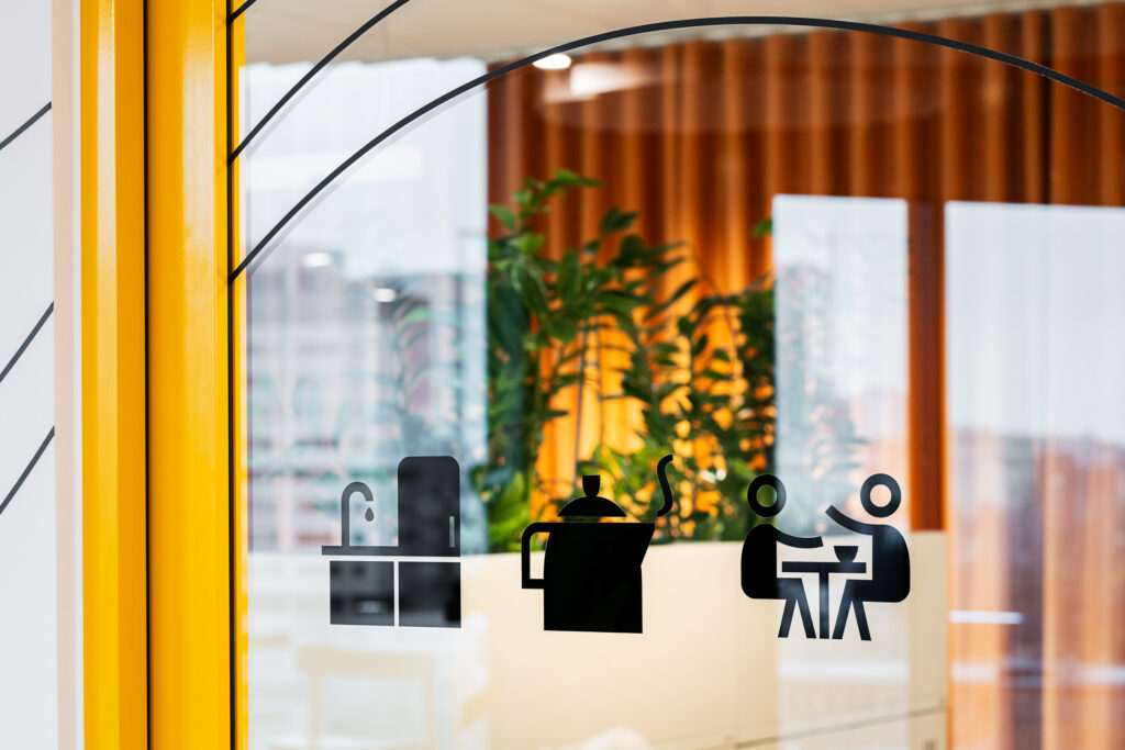
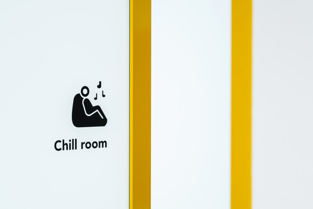
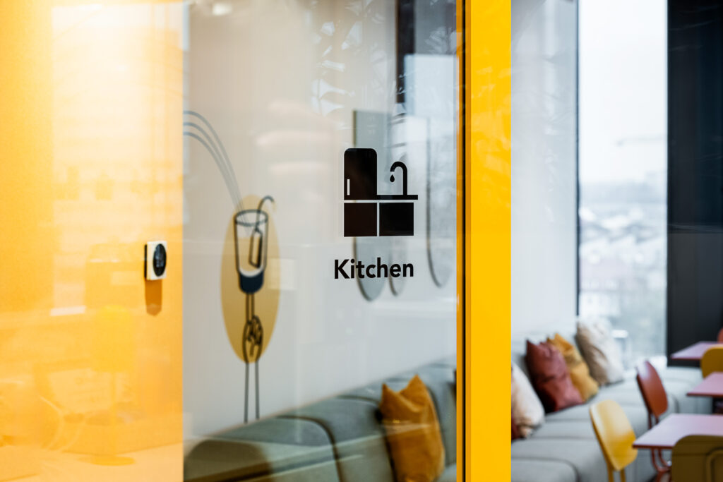
In addition, a set of unique pictograms and illustrations was created specifically for the project. Their visual language is inspired by the graphic style used on Lipton Teas and Infusions packaging – bold yet friendly, expressive but clear. The illustrations reference flavours, ingredients and moments associated with Lipton beverages, translating familiar brand cues into a spatial and functional context.Used across signage they reinforce brand recognition and create a cohesive visual identity throughout the office.
Interior project: Workplace
Implementation company: SignSystem
Photos: Michał Jędrzejowski | Bianka Gajdzińska