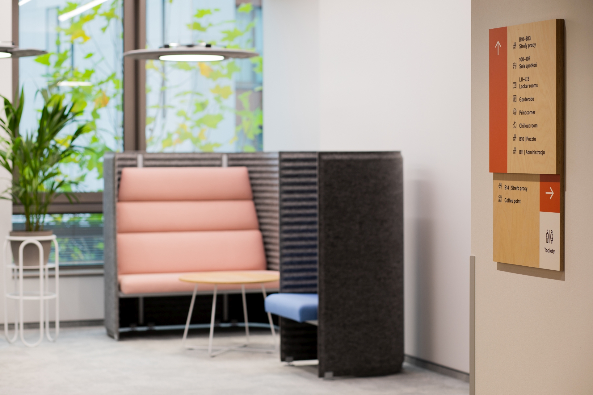
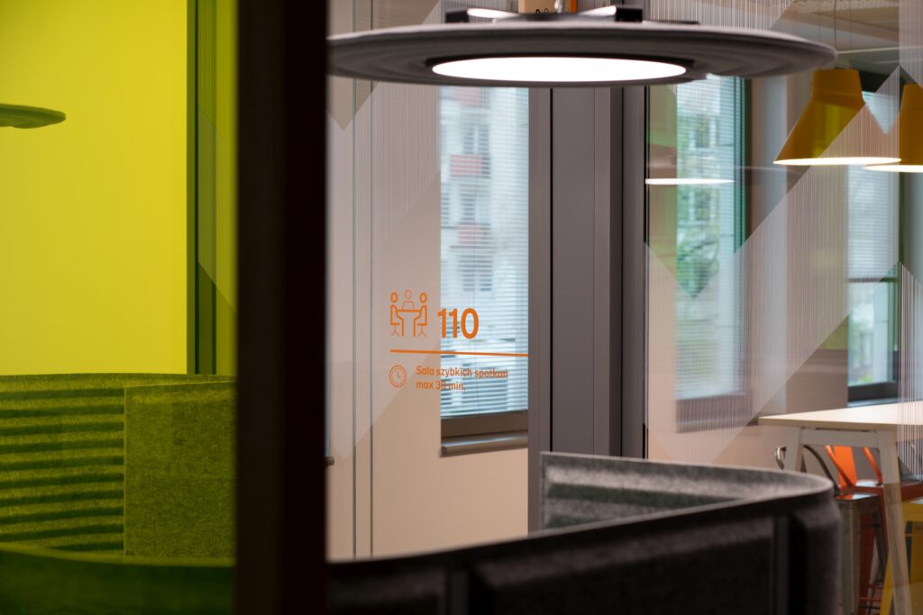
The signage system, prepared for the Warsaw office of the insurance and finance company, in its assumptions directly refers to the existing and widely used corporate brand identity and interior design created by Studio Quadra.
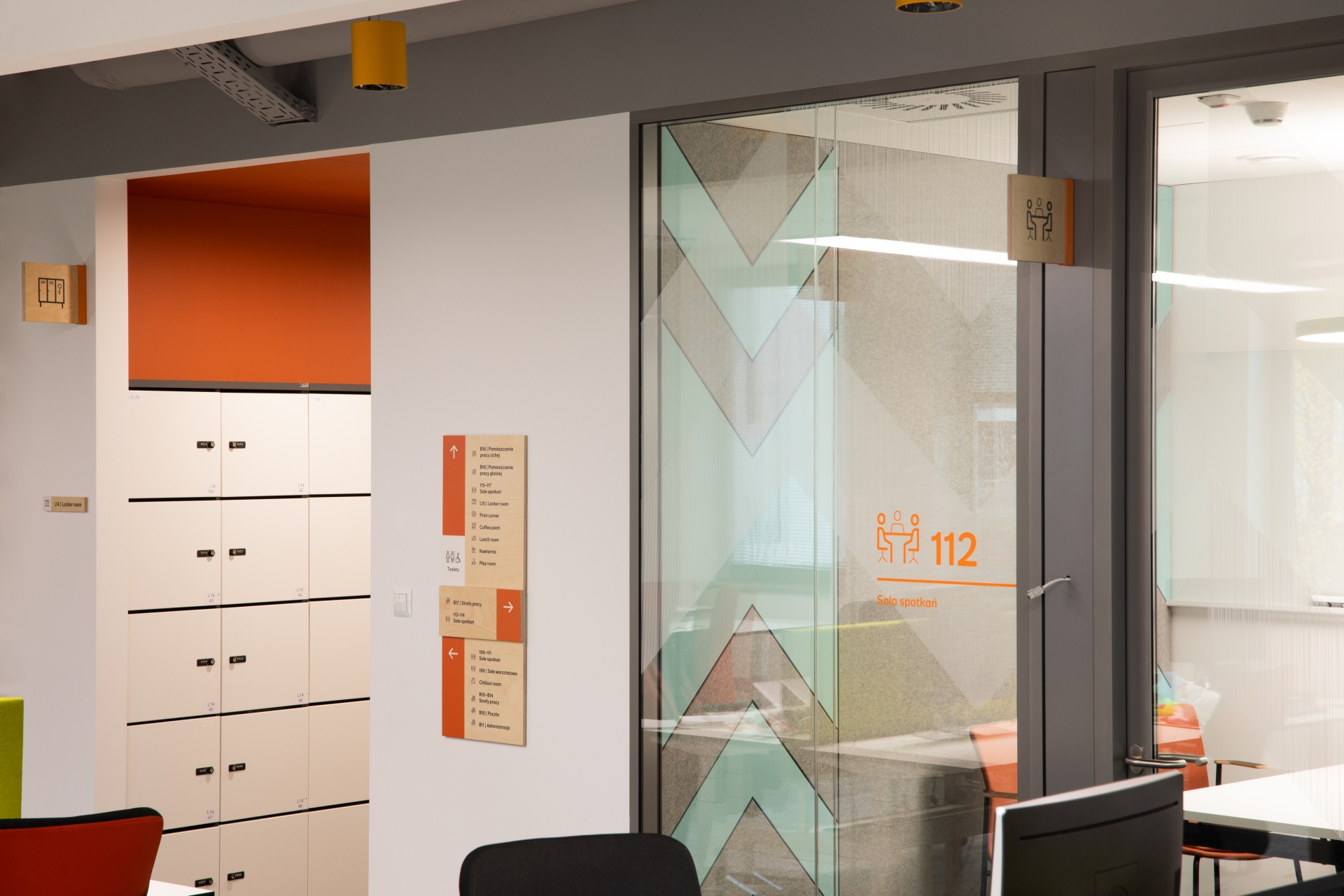
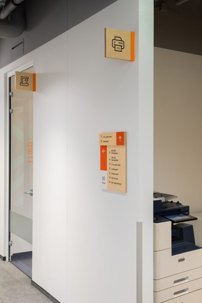
Due to the variety of finishing materials appearing in its spaces and the broad range of colors appearing in the office building’s interiors, we decided to use solutions that would harmonize with them in the widest possible context. The signage we proposed is consistent with the visual character and color scheme of the brand, and complements the modern and “energizing” interior design. As a base for the information carriers, we used plywood of natural hue, painted or laminated in places. It fits perfectly with the interior design of the project and introduces a soothing, warm material accent.
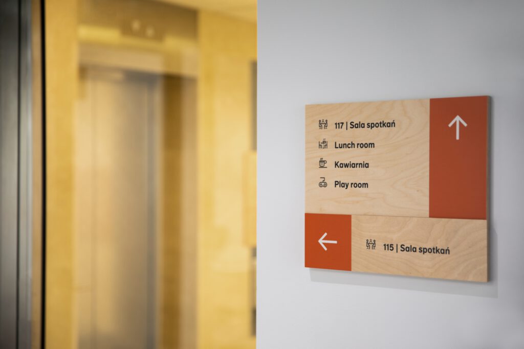
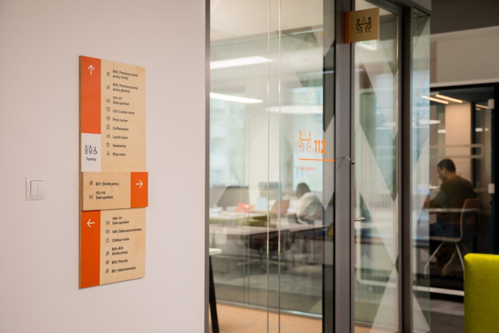
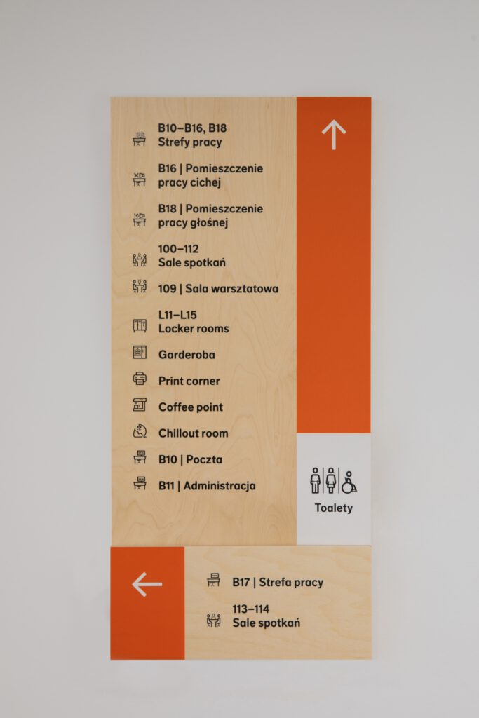
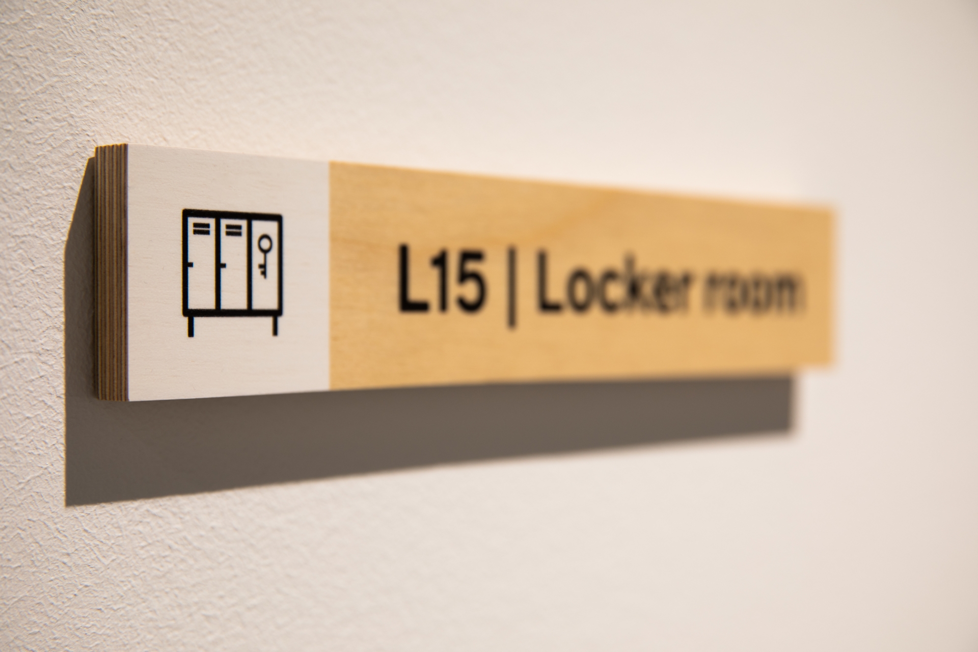
Each of the boards is built of repeating simple modules that allow to segregate and highlight information. Some of them have interesting finishings, such as painted/covered edges, or grouping of information by using layers of plywood of two thicknesses. The color scheme we proposed is simple – black and white. They organize the content and allow the best possible contrast for the graphics, while branding orange is responsible for visually “turning up” the system.
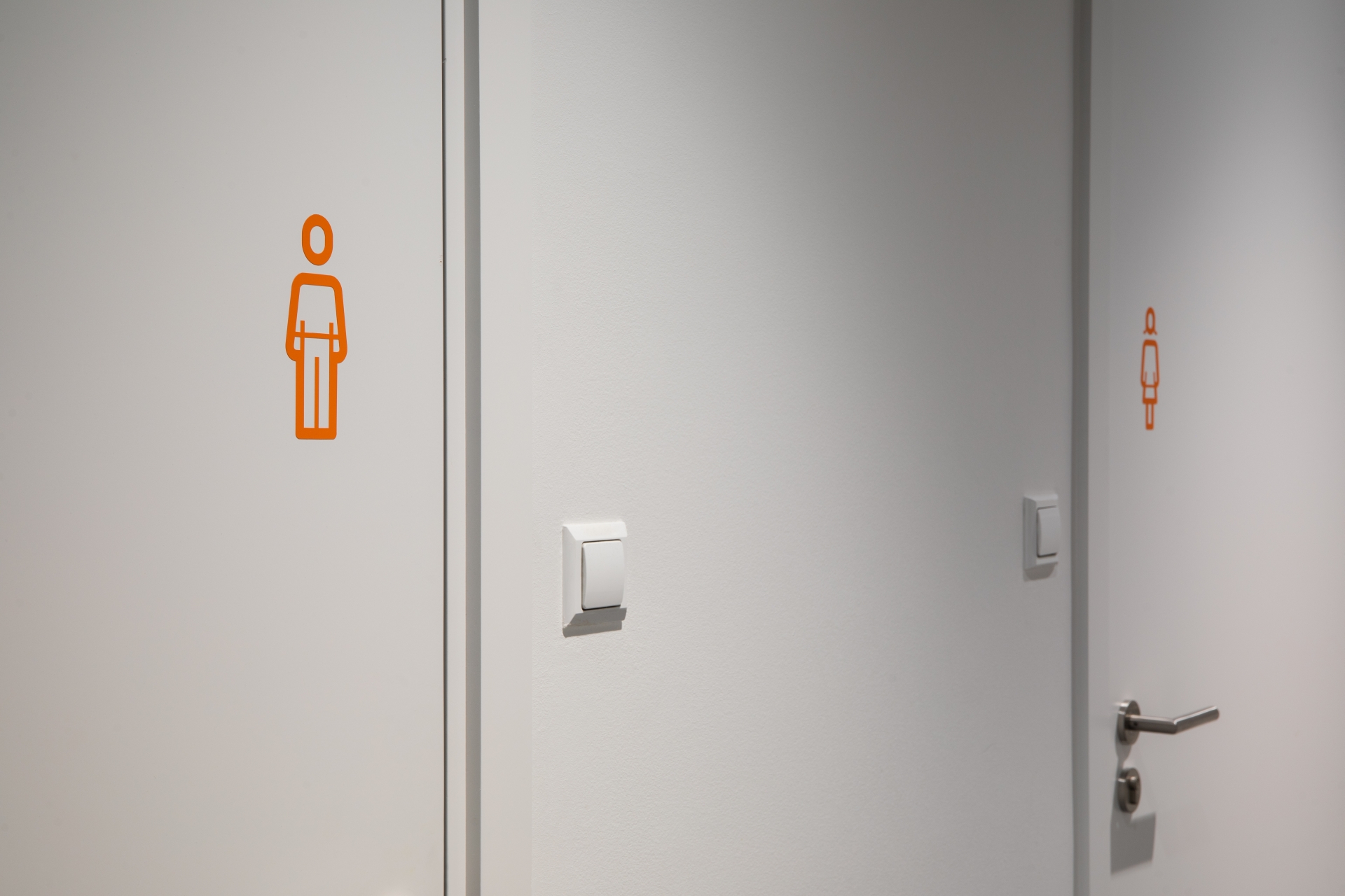
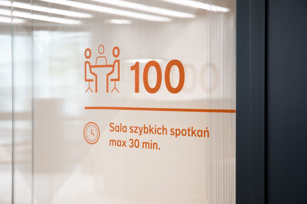
The typeface appearing in the signage system, FF Dagny, is directly taken from the brand’s branding – to keep messages consistent in office spaces as well. To complement the wayfinding system, we also designed a set of dozens of pictograms. The icons are inspired by the typeface and take into account the desired and described in the brandbook principle of building pictograms using two thicknesses of lines.

