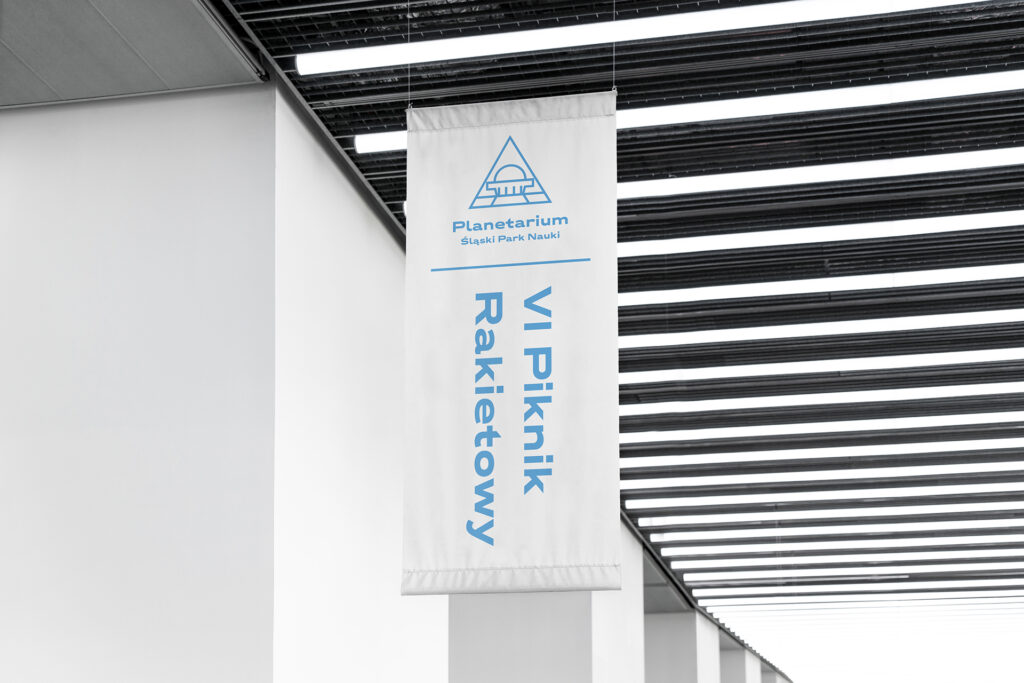
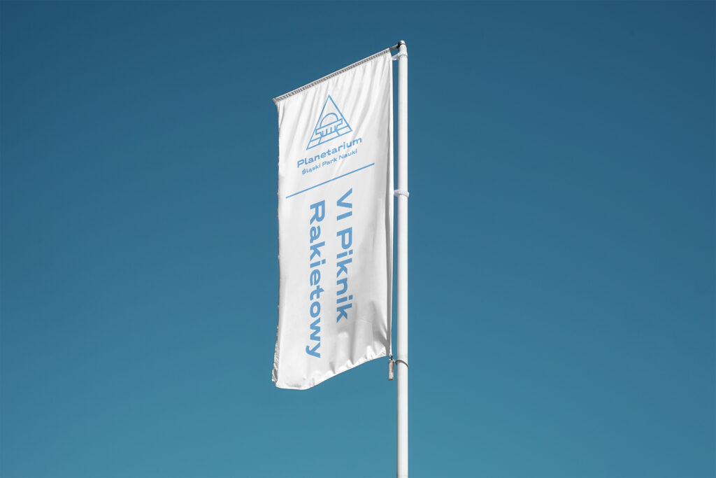
The work on the new, modernised Planetarium logotype assumed preserving the characteristics of the previously used logo. The previously existing solution had many limitations – including an illegible, unfortunate, archaic typographic component; the shape of the Planetarium was not precisely drawn, and it was too illustrative. That is why we decided that the lifting of the logo should include, above all, the simplification and updating of the Planetarium’s image, while retaining the characteristic features of the logo, i.e.: the leading colours, the triangular shape and the placing of a recognisable outline of the building in the signature. We benefited from our experience in designing pictograms – the new sign is a minimalist, expressive and up-to-date representation of the previous signet.
To tie the branding together even more clearly – we proposed using the typeface Laslo Wide, which was also to appear in the planned wayfinding for the new Planetarium building. The typeface was visually consistent with the history of the institution’s founding (the 1950s), while at the same time meeting the requirements for typography used in such brandings: it was minimalist and perfectly legible in a variety of applications.
The simple, linear shape of the new logo made it possible to reproduce it on many levels – advertising materials, educational materials, gadgets. The linear-based language provoked us to create a proposal for a visual design line that could consist of ‘technical’, playful illustrations – a starting point for the refreshing of the Planetarium’s visual identity.