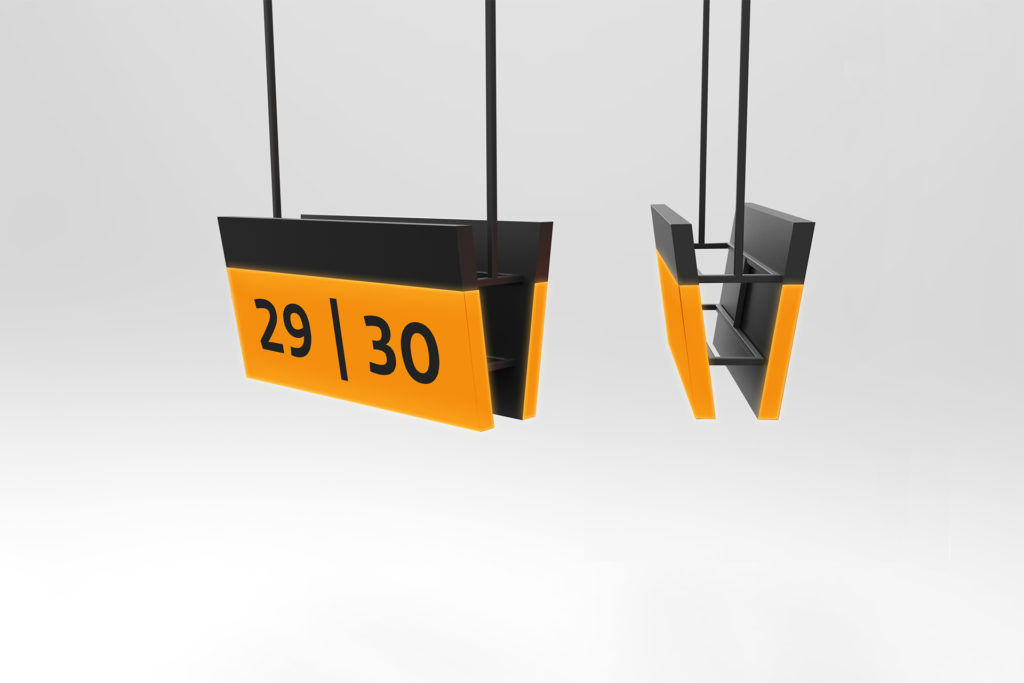
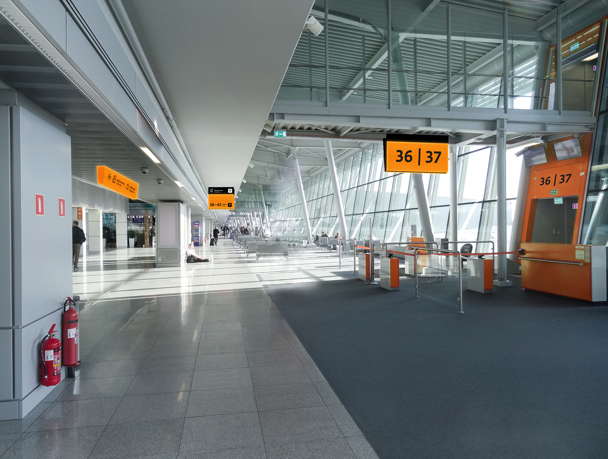
The wayfinding system designed for the Warsaw Chopin Airport was intended to provide new solutions for users moving around the facility. The solutions covered all communication to and from the Chopin Airport and each passenger’s step, from entry to exit. Main problems we have had to face were information chaos and a large accumulation of carriers.
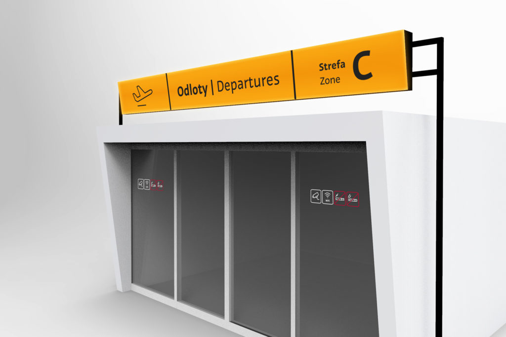
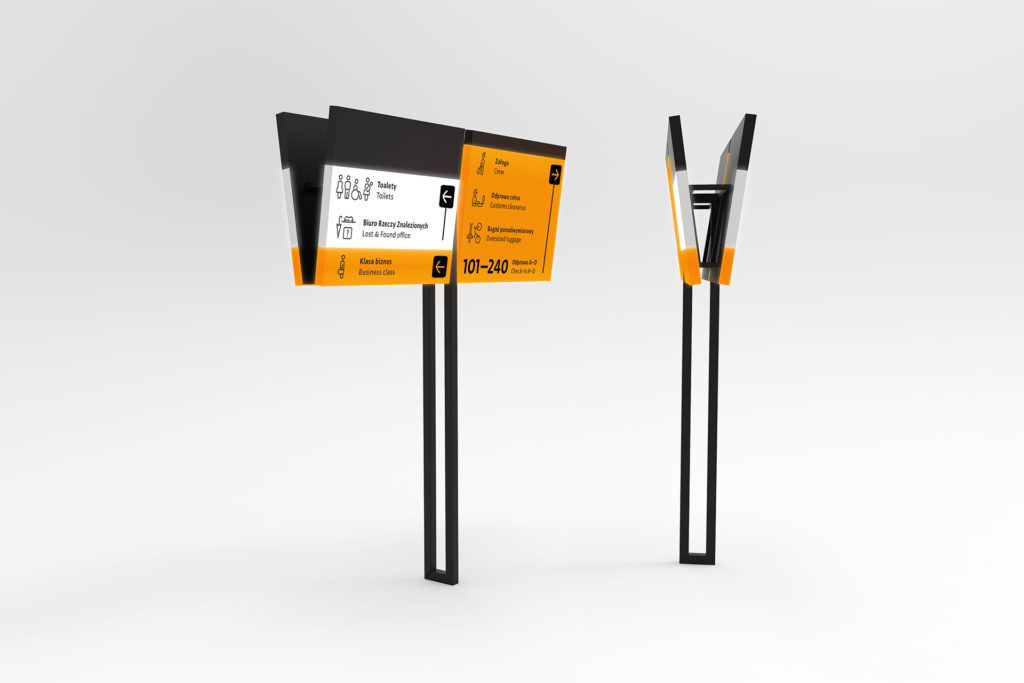
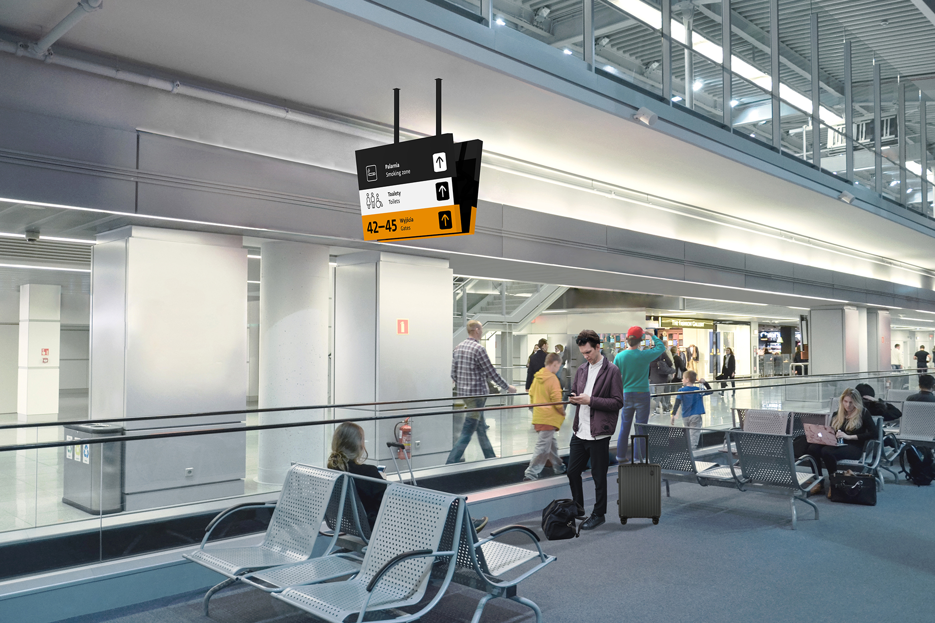
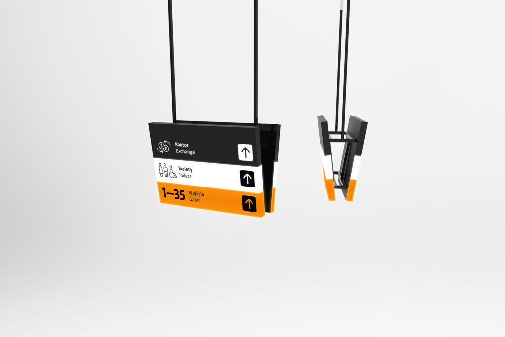
The most important aspect of the wayfinding system here was achieving the high readability of messages. We have done this by matching all airport functions with three color categories. The most important messages always appear on an orange background. Any other information was matched with black and white color, creating a high contrast and increasing readability. The design of carriers was adapted to the airport’s architectural limitations. The carriers were consistent and designed in most readable way.


