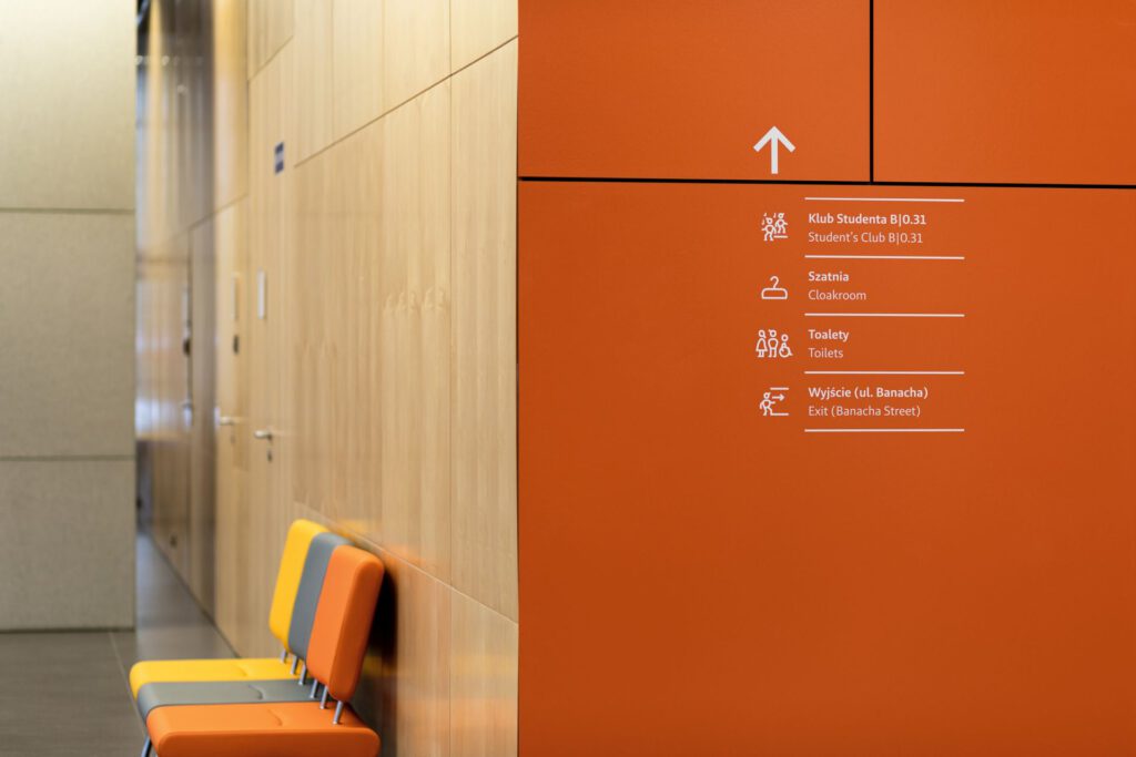
The building of the Faculty of Physics is part of the urban and architectural concept created by Kuryłowicz & Associates. The building is located in Warsaw’s Ochota district, at the intersection of Pasteur Street, Winnicka Street, and Banacha Street. The building was constructed in two stages linked by a skywalk above an internal street. Entry points for both parts are located on opposite sides, connected by an internal passageway. The passageway opens to four green courtyards that serve as recreational, educational, and integration spaces. Among the impressive features of the building is its ground floor, which includes a library, lecture halls, two patios (oval and rectangular), cafeterias and administrative offices. It is the area that attracts the most users and unifies various functions of the building. As soon as we enter the building, we have the opportunity to form an aesthetic impression and gain an understanding of its layout.
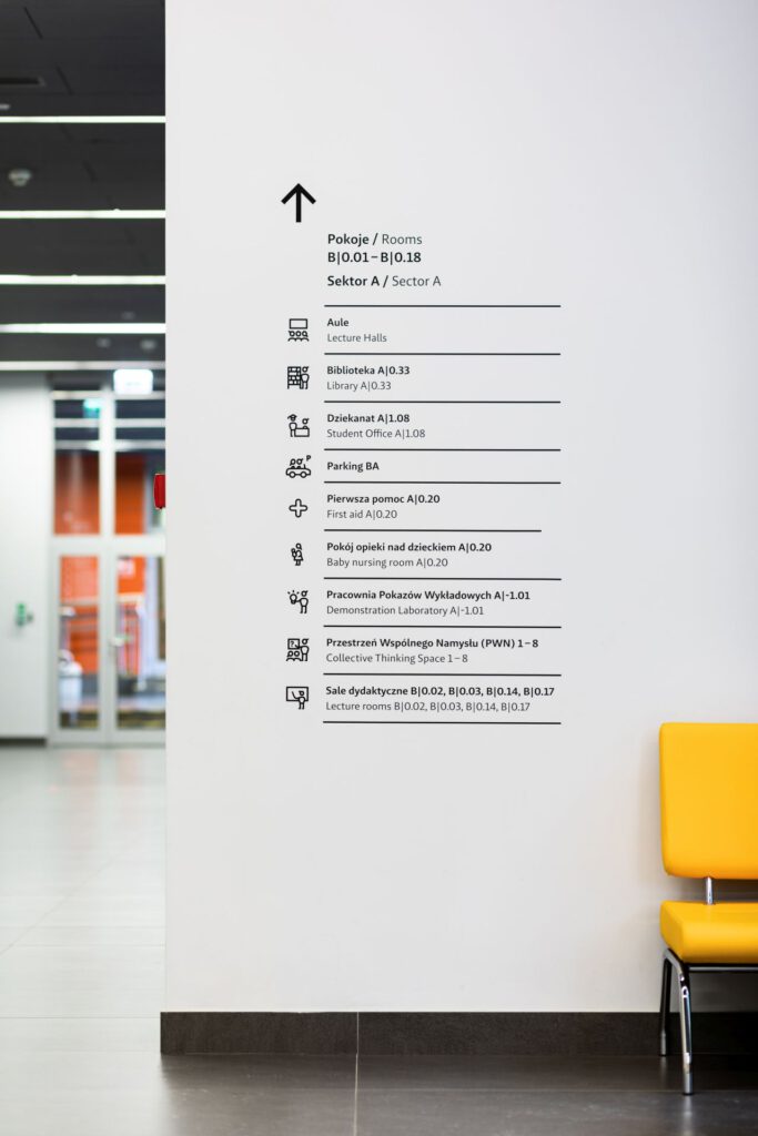
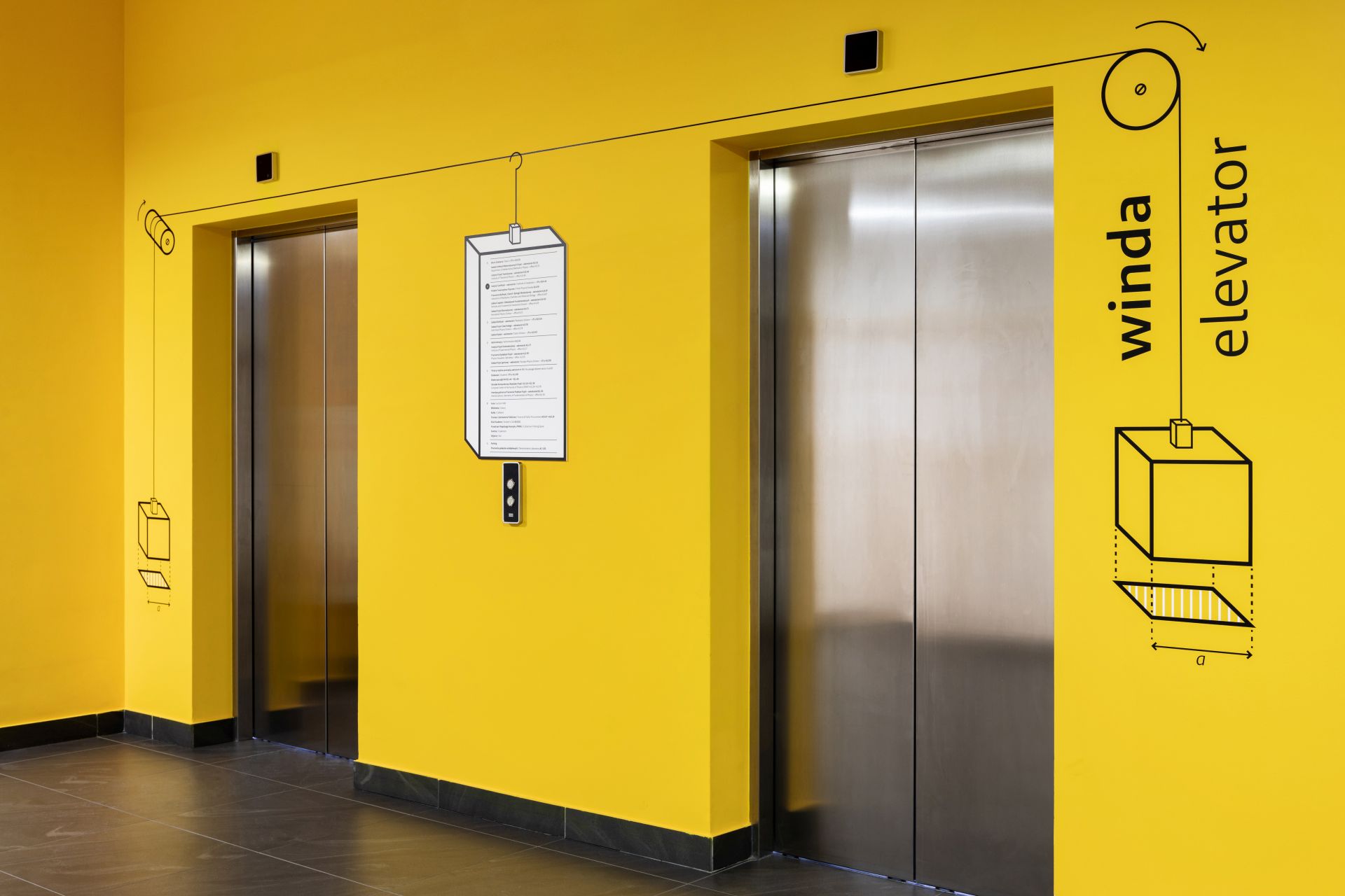
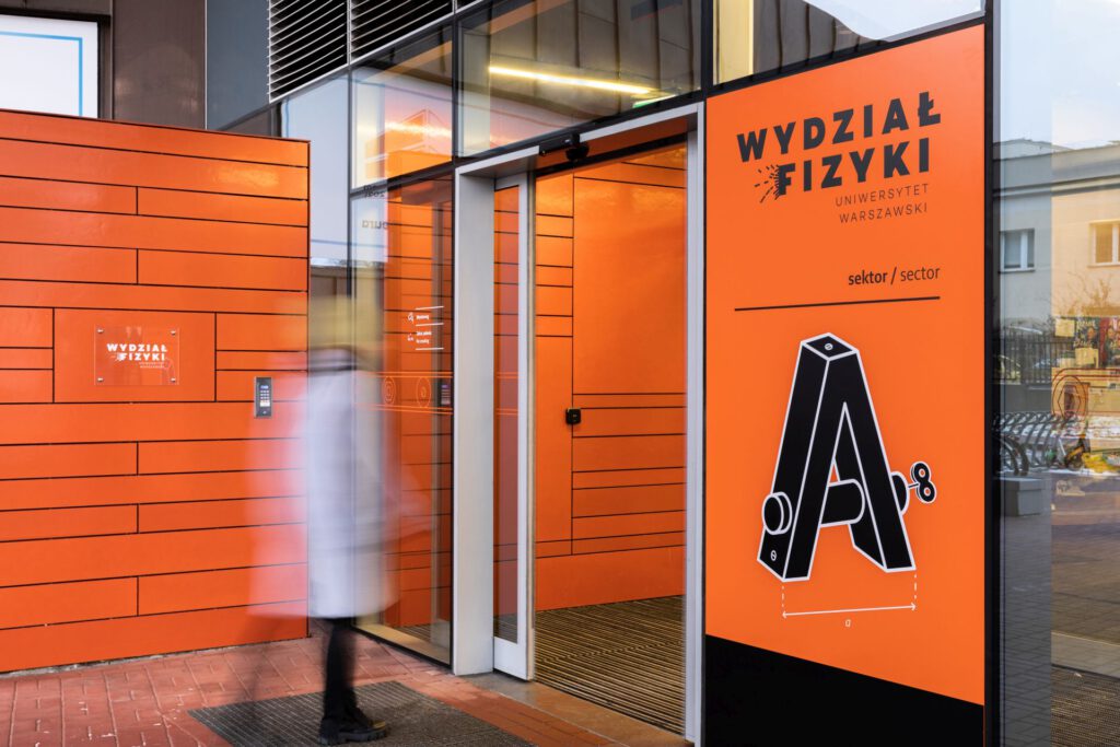
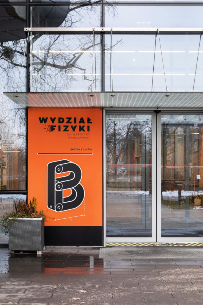
When starting work on the visual identification system (wayfinding) for this space, we set our sight on creating signage system that would be original and unconventional in its form, readable by a wide range of potential users (students, professors, guests) and, in a way, evoke the most common associations with physics. Our design goal was to make this complex building more friendly and accessible in spatial reception. In addition, we wanted to provide employees with tools through which they could inform the faculty about important events that took place in lecture halls, studios, etc. in a consistent and aesthetic way.
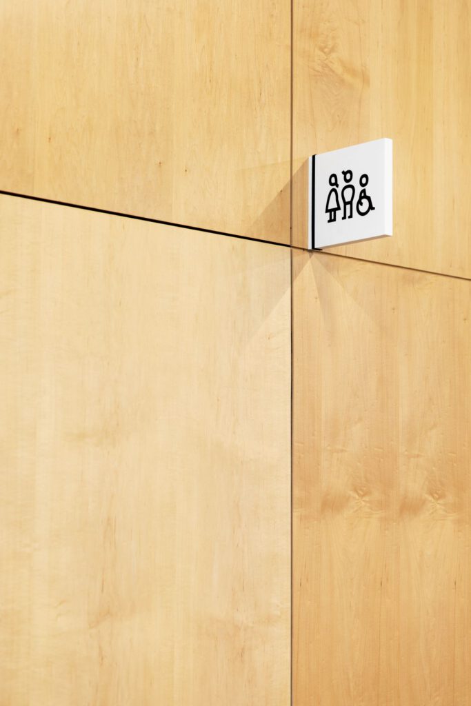
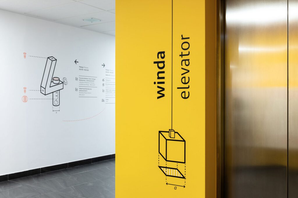
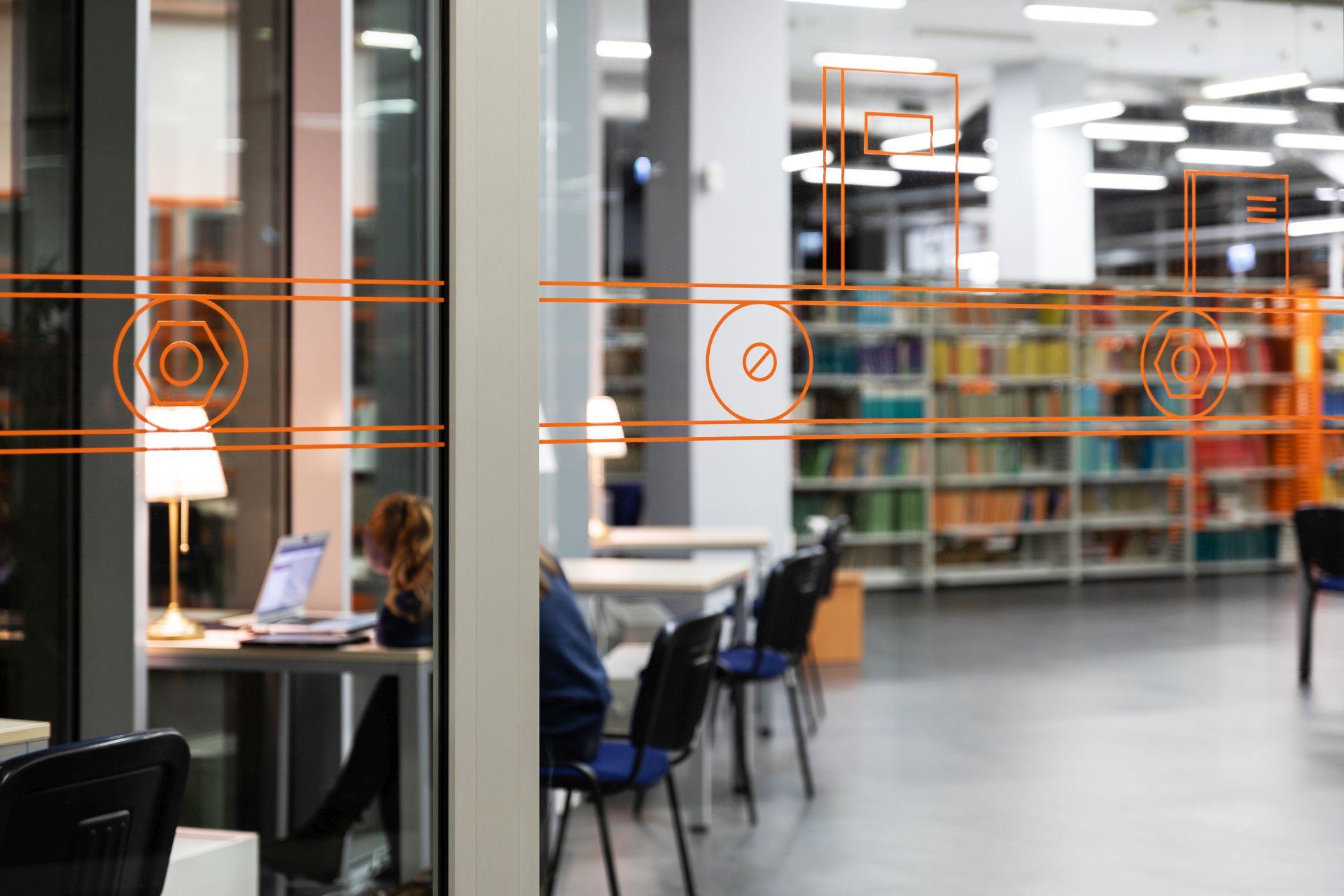
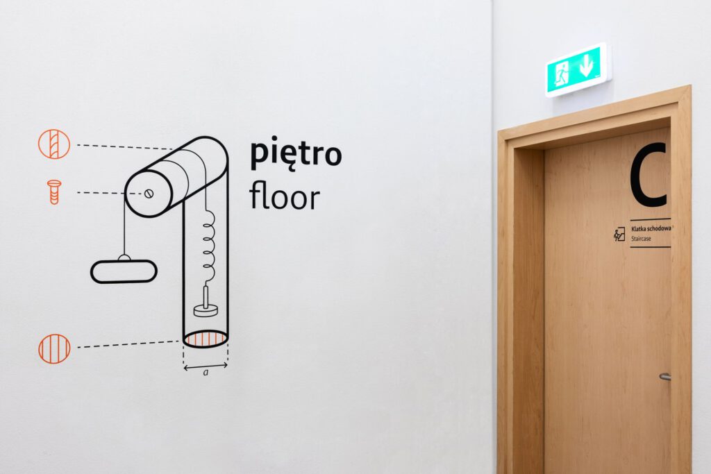
When designing the signage system, the first aspect we took care of was to ensure that our design would complement the expressive interior architecture, where we can find strong, contrasting colors. We came up with a simple idea for project execution. The signage system was based on visual references to technical drawings, experiments, diagrams, and activities from physics textbooks. We have created a set of original numbers, letters, and image graphics based on these assumptions. The design has been accompanied by a minimalist and functional typeface, Brando Sand (Bold Monday), as well as an extensive set of original, characteristic pictograms. Properly prepared icons enhance the message, strengthen it, and allow the user to find a room with the appropriate function. Pictograms in the project are based directly on the typeface and are derived from specific elements within the letters. As a result, they are in harmony with both the font and graphics displayed inside the building.
In the design part of the project, we were looking for distinctive, but non-dominant solutions. We have chosen materials that provide a great background for our concept and don’t overpower the rooms and spaces. In places where information carriers change dynamically and require frequent exchanges, we have proposed an interestingly constructed carrier that enables message exchange.


